What Is Pareto Analysis? How to Create a Pareto Chart?
In the technologically advanced world backed by data visualization, you’ve likely come across the term “Pareto Chart.” This unique tool, a line and bar graph blend, offers a clear view of events and their cumulative percentages. It’s a go-to for identifying the “vital few”—categories contributing up to 80% of a problem—and the “useful many”—the remaining categories.
However, with a Pareto Bar Chart, a project manager can simplify their complex tasks and prevent risks. Let’s delve into an example. Imagine an audit of business processes with various types of findings. How would these findings be represented on a Pareto Chart? Let’s explore this further.
What is a Pareto chart?
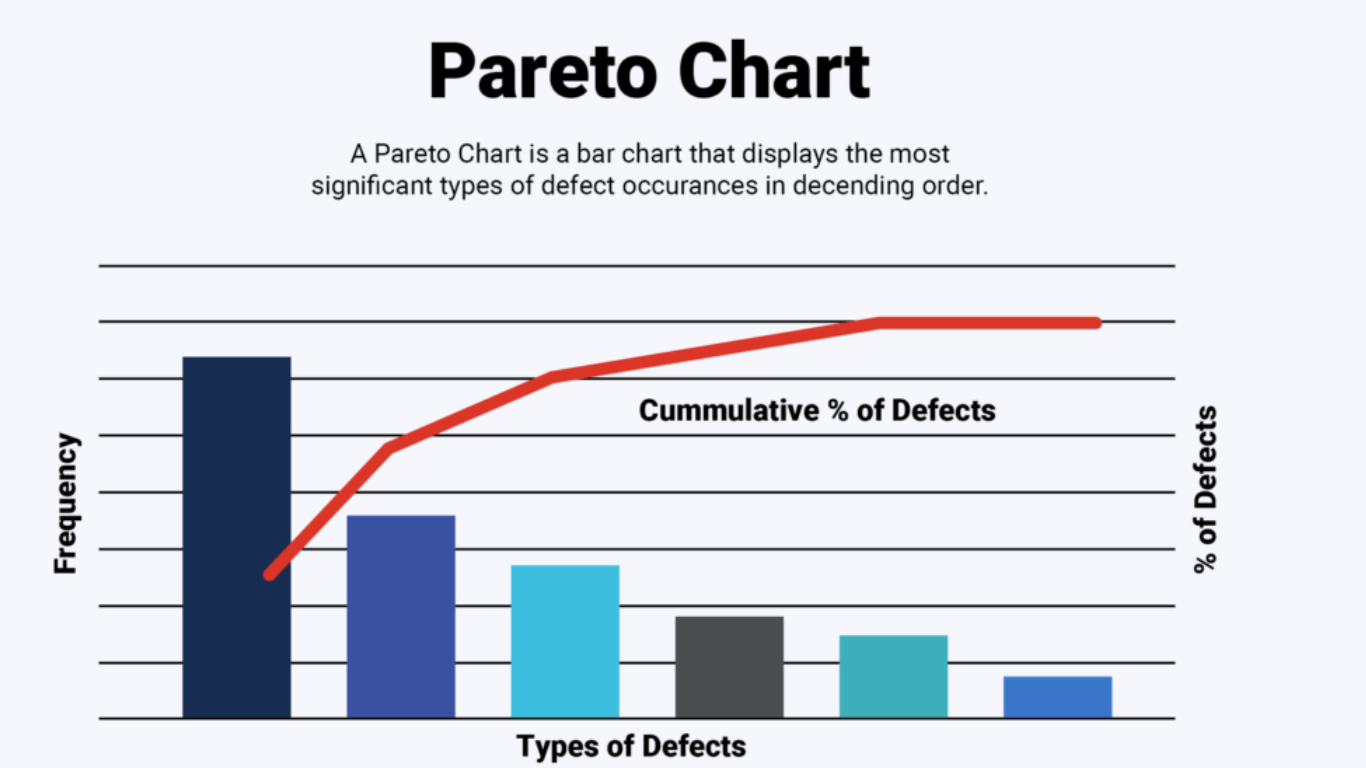
The Pareto Chart often called a Pareto Diagram or Pareto Analysis. At first glance, a Pareto chart appears to be a simple bar graph. The longest bars live on the left, representing the highest frequency or cost (either time or money), and gracefully descend to the shortest bars on the right. This setup allows the Pareto Chart to spell out which issues carry the most weight visually. It’s not a random decision that classifies this chart among the seven basic quality tools found in root cause analysis.
Key Benefits of Using a Pareto Chart?
Beyond the ease of creation and use, the Pareto chart offers numerous benefits, firmly establishing itself as a go-to data analysis and reporting tool. We’ve highlighted four essential advantages for you to leverage in data analytics and reporting scenarios.
1. Prioritization
One of the main benefits of a Pareto chart is task prioritization. The Pareto effect pinpoints the vital 20% that, when focused on, brings forth the most significant total impact. You spend less time, energy, and resources on matters that yield little results and pay more attention to those that return the most benefit..
2. Visual Representation
The visual representation capability of Pareto charts stands out as another primary advantage. Not only do they express individual values using descending bars, but they also visually portray the cumulative total of these values in percentage form.
3. Data Interception
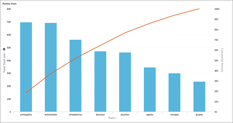
Pareto charts enable practical data interception. This is evident in how these charts depict profit generation across different cities in the United States. A quick glance at the chart swiftly reveals cities with the highest profit margins in the current and previous periods. It’s an ordered bar chart, allowing the reader to distinguish the top performers from those trailing.
4. Communication
The Pareto chart is ideal for communicating data. Users can understand data categories, measurement units, and other essential details with a clear title, key, and annotations. The chart’s visuality allows for an easy grasp of data, making it simple for you to share the discovered insights with relevant stakeholders in an easily digestible manner.
5. Problem Solving & Goal Setting
The use of Pareto charts extends into problem-solving and goal-setting. Companies that are successful at spotting bottlenecks or problems swiftly tend to achieve higher profits, encounter less wastage, and enjoy a more favorable brand reputation. Turning to Pareto charts allows you to steer clear of potential issues and set more realistic and impactful goals.
When To Use a Pareto Chart?
In an ocean of data points with varying levels of significance, it may be challenging to identify the ‘vital few’ and ‘useful many’. This is where a Pareto chart demonstrates its true utility. A Pareto chart helps you filter through the sea of data and concentrate your efforts on the few parameters that generate the most results.
Let’s say you’re auditing business processes and recording different types of findings. It’s natural that you’d encounter recurring patterns or findings—but not all of them hold the same weight. When it comes to problem identification, a Pareto chart reigns supreme. It’s more precise and enlightening, guiding you toward data points worthy of your attention. It’ll save you valuable time by spotting patterns that might not be immediately apparent in a sea of information – offering a clearer, more efficient pathway to problem-solving.
What are the Advantages and Disadvantages of Pareto Chart?
When analyzing data, it’s essential to consider various tools, including the Pareto chart. Here, we’ll be discussing the advantages and disadvantages of a Pareto chart.
Advantages
- One substantial benefit of a Pareto chart is its efficiency. Utilizing a Pareto chart, you’re able to identify recurring patterns in your data quickly. C
- By presenting the survey results in a Pareto chart, you can promptly identify issues that have the greatest frequency, such as the most common reasons for product returns.
- Another advantage of the Pareto chart is its ability to concentrate on significant issues. With its cumulative percentage line, you can determine what problems account for the majority of the overall percentage.
Disadvantages.
- While efficient in identifying the biggest problem, the chart may not efficiently depict the depth of the problem or potential solutions’ magnitude.
- Lastly, Pareto charts cannot calculate the average or complex statistical data. They don’t provide the mean or standard deviation, which are essential measurements for understanding how much variability exists within your data.
How to Create a Pareto Chart?
Creating a Pareto chart may seem a daunting task, but it’s pretty straightforward once you understand the steps. We’ll take you through this process using an example of a Pareto chart, focusing on five key stages.
Step 1: Data Collection & Categorization
Start by identifying the issue you’re examining and collecting relevant data. Pinpoint the types of defects and record their frequencies, then categorize your data accordingly. In the example of a Pareto chart provided, quality analysts collect a random sample of data and categorize the types of defects before moving to the next stage.
Step 2: Data Ranking by Impact or Frequency
Now you’ve sorted your data into categories, it’s time to calculate the impact of each category. Assign a numerical value based on factors like cost, time, or number of people affected. Rank your unordered categories in terms of frequency or impact, preparing your data for the next stage – the bar chart creation.
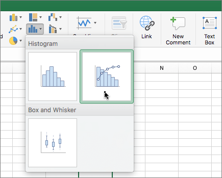
Step 4: Bar Chart Construction
Creating a bar graph is straightforward with modern software tools. Illustrate your categories on the x-axis and denote the frequency count or impact on the y-axis. Draw vertical bars corresponding to the value or count of each category. Remember, arrange your bars in descending order for clarity.
Step 5: Cumulative Percentage Calculation
Having drawn your bars, calculate and add each category’s cumulative percentage line. Use the following formula:
Cumulative Percentage = (Cumulative sum of Y-Axis Frequency Counts / Impact Value) / Sum of All Counts and Values * 100
This step requires adding the value of each data set to the sum of all previous data points in a sequence.
Step 6: Cumulative Percentage Line Addition
The final step is incorporating the cumulative percentage line into your chart. This line graph is drawn by joining the cumulative percentages of the categories. Your Pareto chart is now taking shape.
Conclusion
Pareto charts are not just graphs; they’re strategic tools. They help you identify and prioritize the big issues that need your attention. Their visual appeal makes data interpretation a breeze and communication with stakeholders crystal clear. They’re problem solvers, guiding you to the root cause of issues and paving the way for practical solutions. Whether in manufacturing, quality management, or business intelligence reporting, Pareto charts are your allies. They’re about making the most of your time, resources, and efforts..
Frequently Asked Questions
Q1. What is the purpose of a Pareto chart?
A Pareto chart is a visual tool commonly used in data analysis to easily identify the most significant issues or factors in a process. It assists in prioritizing tasks or problems effectively by showcasing the relative impact of different problems or factors in a descending bar graph.
Q2. Can you explain the Pareto chart in layman’s terms?
Simply put, a Pareto chart is a combination of a bar graph and a line graph. Individual values are shown in descending order by bars, while the line depicts the cumulative total. It enables swift identification of key issues and efficient task prioritization.
Q3. What is the key highlight of a Pareto chart?
The Pareto chart is invaluable for pinpointing problems that, if solved, could yield significant improvements. It does this by visually emphasizing these problems’ relative frequency or scale in a descending bar graph, effectively highlighting the total impact they hold.
Q4. What kind of data is required to make a Pareto chart?
To create a Pareto chart, you need to measure quality or frequency, broken down by various contributing categories. The measure of quality or frequency should capture the negative impact of the issue you’re examining and should be agreed upon by all stakeholders.
Leave a Reply