Project Management Charts for Effective Project Planning
Ever felt like you’re juggling too many tasks at once? You’re not alone. In the complex world of project management, it’s easy to get overwhelmed. That’s where project management charts come in. These visual aids can be a game-changer, helping to streamline processes, improve team communication, and keep your project on track.
From Gantt charts to PERT diagrams, there’s a wide array of Project management charts to choose from, each with its unique benefits. But how do you know which one to use? Don’t worry, I’ve got you covered. I’ll guide you through the maze, helping you find the perfect chart for your project needs. So, let’s dive in and start making sense of project management charts.
Understanding Project Management Charts

Project Management Charts simplify the task of managing intricate projects. They offer a visual representation of schedules, tasks, and progress, making crucial project details easy to understand.
The Role of Charts in Project Management
Charts serve as an integral part of project management. Acting as visual aids, they provide a clear picture of the tasks, responsibilities, and deadlines. They act as reference points for project teams, aiding in tracking progress, identifying bottlenecks, and maintaining organizational flow. For instance, depictions of task timelines keep team members accountable, ensuring deadlines are met.
Types of Project Management Charts
Just like phases of project management, there are numerous charts which cater to different aspects of project management. Some commonly used ones include:
- Gantt Chart: Visualizes the project schedule. It outlines the initiation and completion of tasks, allocating proper timeframes (E.g., Task 1 starts on Jan 1 and ends on Jan 15)
- PERT Diagram: Shows the dependencies among tasks. This is ideal for understanding the sequence in which tasks need completion (E.g., Task 2 can’t start until Task 1 finishes)
- Kanban Board: Focuses on workflow visualization. It places tasks as they move through stages of completion (E.g., “To Do”, “In Progress”, “Done”)
- Burndown Chart: Reveals the rate at which the team is completing tasks. It’s useful when needing to gauge remaining work (E.g., 10 tasks remaining out of 20)
These charts, each with its unique strengths, provide an effective method for managing tasks. The choice depends on the specifics of the project and the team’s preference.
Gantt Charts: The Cornerstone of Project Planning
Moving from general project management charts, let’s narrow our focus to Gantt charts. These are considered a staple in project management, often revered as the cornerstone of project planning.
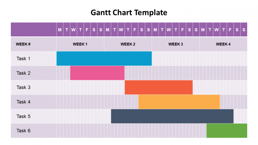
What is a Gantt Chart?
A Gantt chart, named after Henry Gantt who refined this powerful planning tool in the 1910s, is a horizontal bar chart used in project management. It visualizes the entire project schedule, displaying the start and finish dates of the terminal elements and summary elements of a project. Terminal elements and summary elements comprise the work breakdown structure of the project, allowing me to create a precise timeline for each task involved.
This type of chart integrates task sequences, durations, deadlines, and resources, making it easier to coordinate all the work. The left-hand side typically lists the task names, while the bars on the right provide a visual representation of their planned duration.
Advantages of Using Gantt Charts
Gantt charts hold a revered spot in project management for good reasons. Here are a few advantages of Gantt Charts:
- Visual simplicity: Gantt charts turn complex information into an easy-to-read visual format. Everyone on the team gets a quick, clear idea of the project timeline, roles, and tasks.
- Real-time progress tracking: With a Gantt chart, I can track project progress in real-time. Any shifts in task timelines or delays get displayed immediately, helping to identify potential bottlenecks swiftly.
- Improved planning and coordination: These charts allow efficient planning of resources and time. They also facilitate better team coordination, as every team member can see how their tasks align with others and understand the impact of any change.
- Enhanced communication: Gantt charts serve as a visual communication tool that aids in setting realistic expectations for stakeholders and keeps all involved parties informed about the project status.
Through these advantages, Gantt charts prove their indispensability for strategic planning, efficient project execution, and regular progress tracking. Their ability to simplify complex projects into manageable, visually apparent tasks makes them an unbeatable choice in project management.
Kanban Boards: Visualizing Workflow
Transitioning from Gantt charts, we now turn our focus to another popular project management tool: Kanban Boards.
The Basics of Kanban
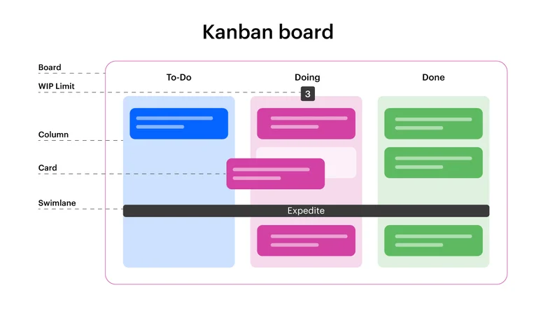
Originating from Japan, Kanban holds its roots in industrial production, specifically automotive manufacturing. However, it’s not tied down to manufacturing, as it’s flexible enough for any project task, big or small. Simply put, a Kanban board is a visual workflow tool consisting of columns and cards. Each column represents a stage of work, for instance: “To Do”, “In Progress”, and “Done”. Meanwhile, the cards represent tasks, moving from one column to another as work progresses.
All tasks on a Kanban board are visible, providing a snapshot of the project’s status. The board aims to identify bottlenecks in the project workflow, enabling quicker reaction times, faster problem-solving. That’s the basic understanding of Kanban, a simple yet powerful tool that promises to streamline project workflows, making them more productive and efficient.
How Kanban Boards Benefit Project Teams
Project teams find Kanban boards incredibly helpful. They offer numerous benefits on multiple levels. For starters, they grant total visibility of projects, displaying all tasks in one view – a key element in effective project management. This transparency enables team members to see workload allocation, ensuring a balanced distribution among team members. It helps to ensure no team member is over or underwhelmed with tasks, giving fair chances to everyone.
Next, Kanban boards improve communication and collaboration among team members. The visual nature of Kanban makes it easier to discuss and assign tasks, acknowledging what everyone is working on, and reducing potential misunderstandings.
Thirdly, it adapts to change. Unlike project management methods that require fixed timelines, Kanban eases making updates or changes on-the-go, allowing team agility.
The last but not least, it encourages continuous improvement. By identifying bottlenecks, teams can optimize their processes. Teams tend to make small, continuous changes that lead to significant improvements over time.
In sum, Kanban boards aren’t just visually appealing tools. They are robust project management tools that offer transparent work visualization, improve communication, adapt to changes and foster continuous improvement.
PERT Charts: Simplifying Complex Projects
After breezing through the dynamic Kanban boards, we now turn our attention to another project management marvel, the PERT chart. Deploy this chart and behold as it unwinds the intricacies of your complex projects.
Defining PERT Charts
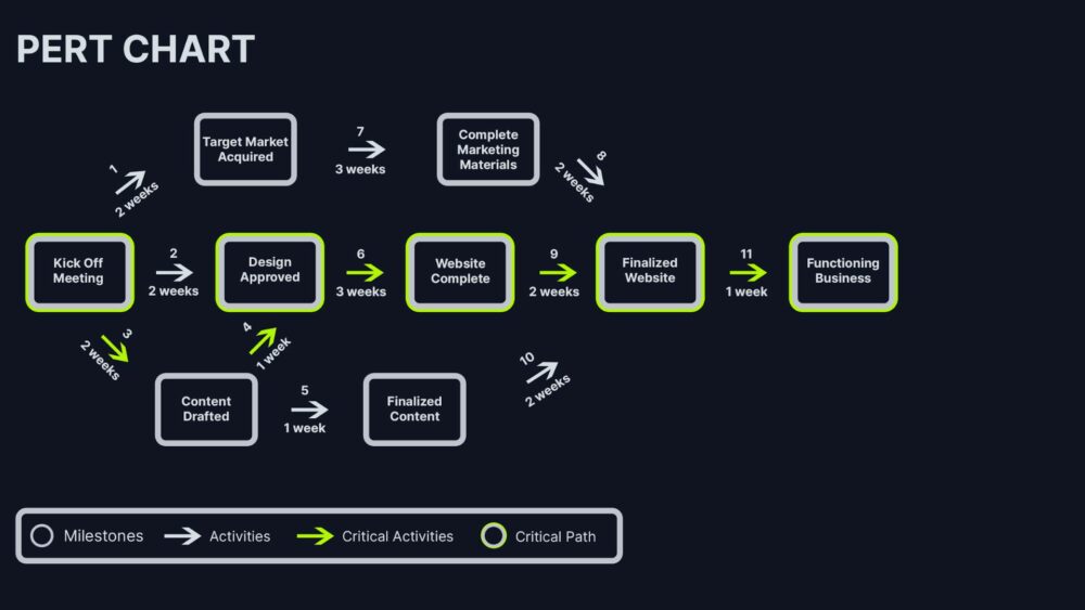
A Program Evaluation and Review Technique (PERT) chart is an intuitive visualization tool in project management. It maps out all the pivotal tasks within a project and the dependencies between them. The PERT chart, in essence, features circles called nodes, representing the project tasks. Arrows link these nodes, illuminating the sequence of tasks and their integration. However, it’s the flexibility of these charts that sets them apart; they categorically address the reality of project uncertainties.
PERT charts also authenticate three estimates for each task: optimistic, pessimistic, and most likely. This trio forms the foundation for projecting the probable completion time for each task and, in turn, the entire project. My recommended sources for learning more about these estimates are the Project Management Institute (PMI) or the Association for Project Management (APM).
When to Use PERT Charts in Project Management
Onto the prime question: When should you unfurl the PERT chart in your project management arsenal?
Applying PERT charts generally makes sense when you’re navigating a complex project riddled with numerous interdependent tasks. These charts prove to be the guiding light when the timeline of a project is uncertain, or when a project involves unfamiliar territories where it’s hard to provide exact time estimates.
Moreover, under scenarios when a detailed analysis of task sequences and their dependencies is required, PERT charts reign supreme. They shine in their ability to identify critical paths in a project, enabling a clearer focus on those tasks that directly affect the project’s completion time.
In essence, PERT charts can be the compass guiding you through the wideness and wildness of complex project management. Explore more about the practical applications of PERT charts through portals like the Project Management Journal or the Journal for Quality and Participation.
By utilizing these guidelines for using PERT Charts, one can become adept at handling even the most complex of projects.
Critical Path Method (CPM): Timing Your Tasks

Following the exploration of PERT charts, you might wonder what’s next on the list of project management essentials. Step up to the plate, the Critical Path Method (CPM), another powerful tool. In the realm of project management charts, CPM emerges as a clear go-to when looking to nail down precise project timelines. CPM charts show how tasks in your project overlap and depend on one another, allowing you to identify the “critical path”. So, let’s delve deeper and unravel the underlying principle of CPM and explore its integration with other project management tools.
The Principle Behind CPM
CPM, like PERT charts, examines dependencies between tasks. However, it’s in time-related specifics that CPM shines. CPM deduces the shortest possible time necessary to complete a project. It does this by calculating the longest sequence of dependent tasks, otherwise known as the “critical path”. The effectiveness of CPM, despite project complexity, depends on its three pillars: identification of all required tasks, sequencing of these tasks, and estimation of time each task takes.
Let’s say a project consists of five tasks. Task 1 takes three days, Task 2 and 3 take two days each, while Task 4 and 5 take four days each. Combined, these tasks take a total of fifteen days. However, taking interdependencies into account, you figure that tasks 2 and 3 can’t start until task 1 finishes, and task 5 can’t proceed until both tasks 4 and 2 complete. So, the more extended, critical path consists of Task 1 then Task 2, and finally Task 5, taking nine days, not fifteen. You’ve just applied the principle of CPM.
Integrating CPM with Other Project Management Tools
CPM doesn’t exist in isolation. In fact, it harmonizes effectively with other project management tools, such as Gantt charts and Kanban boards. Integrating CPM in Gantt charts, which depict project schedule, can yield a more effective visualization of project timeline, spurring project success.
Moreover, CPM complements nicely with Kanban boards too. While Kanban boards focus on task statuses, CPM gives a detailed timeline view. Therefore, project managers can use CPM and Kanban boards together for a comprehensive view of project tasks and their timing, crucial for efficient resource allocation.
Remember, each tool has its strengths, and selectively pairing them based on your project’s unique needs can optimize project management efficiencies. CPM, therefore, isn’t just another arrow in your quiver—it’s a game-changer when perfect timing matters.
Burndown Charts: Tracking Project Progress
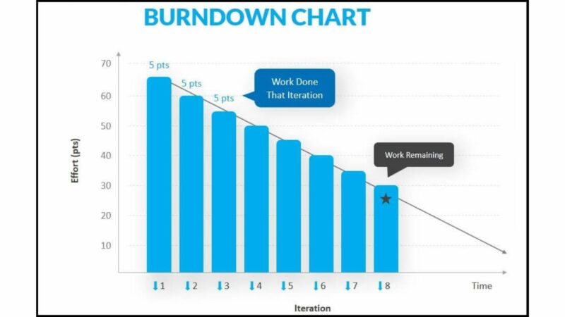
Just as CPM serves as a crucial asset for perfect timing in project execution, Burndown charts act as a powerful project management tool, primarily in the Agile methodology. They track project progress in an easy-to-understand graphical representation.
Understanding Burndown Charts
A Burndown chart gets its name from its graphical representation. As tasks get completed, they “burn down” to zero, and that reduction over time gets depicted graphically. In essence, a Burndown chart is a visual portrayal, featuring a downward slope that depicts the amount of work left in a project versus time.
It’s simple to read a Burndown chart. The vertical axis represents outstanding work while the horizontal axis signifies time. A line starting from the top left, sloping down to the bottom right, illustrates the work getting burned down over time. An ideal Burndown chart line continues in a straight, downwards path, suggesting that work gets finished at a consistent rate. Irregularities in the line’s slope might indicate roadblocks or inefficiencies in the project’s process.
Utilizing Burndown Charts for Agile Projects
For Agile projects, Burndown charts offer valuable insight. They provide real-time tracking of work done versus the planned schedule. This benefit aids teams in identifying whether they’re ahead, on track, or lagging behind on their sprint tasks.
In Agile Scrum, sprints usually last for two weeks or a month. Teams plan the tasks they aim to complete during this time. Hence, Burndown charts become an instrumental tool for constant reevaluation, allowing teams to readjust their work strategies if they’re not aligning with planned progress.
For example, if the line on the Burndown chart appears flat for a few days, it means that no tasks have been completed during this period. In this scenario, the team would reassess their dynamics and find a solution to get back on track.
Overall, Burndown charts prove their worth in numerous ways. Not only do they depict work-progress over time, but they also highlight problem areas, enabling teams to make necessary changes swiftly to ensure project completion within the set timeline.
Choosing the Right Chart for Your Project
With various project management charts like Gantt, Kanban, PERT, CPM, and Burndown, each offering different visualization capabilities and benefits, it becomes vital to pick the right chart for your project. In this article, let’s explore how to choose the right chart and the factors to consider.
Factors to Consider
To choose the right chart for your project, consider four key factors: the project’s complexity, your team’s familiarity with the chart, the planning methodology you’re following, and your project’s changing needs.
- Project Complexity: For simple projects, a Gantt chart or a Kanban board works well as they provide a straightforward visual representation of task statuses. In contrast, for more complex projects with interdependent tasks, a PERT chart or CPM might prove useful.
- Team Familiarity: The effectiveness of a chart depends heavily on the team’s familiarity with the chart style. For instance, Agile teams often find Burndown charts intuitive, while teams new to project management might prefer the simplicity of a Kanban board.
- Planning Methodology: Your project planning methodology often dictates the type of chart you’ll use. If you’re following the Agile methodology, a Burndown chart suits perfectly. Conversely, if you’re using the critical path method, a PERT chart is ideal.
- Changing Project Needs: Your project’s needs might change over time; hence the flexibility of a chart plays a key role. In situations where the project scope varies frequently, a Gantt chart with its ability to represent dependencies and timeline changes can be beneficial.
Comparing Chart Effectiveness
Direct comparison of the effectiveness between charts can be challenging, given the different features and benefits they offer. Let’s highlight two of them — Gantt charts and Kanban boards.
- Gantt Chart: Known for its time management capabilities, a Gantt chart is ideal for projects where task scheduling is essential. It provides a timeline for the whole project, showing exactly when each task should start and finish, making it easy to identify dependencies and overlapping tasks.
- Kanban Board: With its easy-to-understand visual layout, a Kanban board is excellent for workload management. It enables teams to visualize the workflow, identify bottlenecks, and limit work-in-progress, thereby improving productivity.
The choice between project management charts, therefore, comes down to the specific needs and characteristics of your project. You must weigh the pros and cons of each chart relative to your project’s specific demands to choose the right one. Remember, a chart that works well for one project might not for another. Flexibility, therefore, is key in your choice.
Conclusion
Project management charts aren’t just pretty visuals – they’re vital tools for managing complex projects. Whether you’re using a Gantt chart for precise time management or a Kanban board for effective workload management, it’s clear that the right chart can make all the difference. The Critical Path Method is another powerful tool, especially when integrated with other charts for enhanced visualization. But remember, there’s no one-size-fits-all solution. Your choice should depend on project complexity, team familiarity, planning methodology, and changing needs. So, don’t be afraid to be flexible and select a chart that truly aligns with your project’s requirements. After all, the goal isn’t to use the most popular chart – it’s to deliver successful projects.
Frequently Asked Questions
Q1. What are the primary project management charts discussed in the article?
The article broadly discusses three types of project management charts – Gantt charts, Kanban boards, and PERT charts. Additionally, it speaks about the Critical Path Method (CPM) as an essential tool in project management.
Q2. How does the Critical Path Method (CPM) enhance project management?
CPM aids in determining precise project timelines by identifying a project’s critical path. It integrates with other project management tools to improve project visualization and efficiency, thereby streamlining the overall project management experience.
Q3. What factors should be considered when choosing a project management chart?
Factors such as the project’s complexity, team familiarity with particular charts, planning methodology used, and the ever-changing needs of the project are imperative when choosing a project management chart.
Q4. How do Gantt charts and Kanban boards differ in their effectiveness?
While both are essential project management tools, they offer different benefits. Gantt charts are particularly useful for time management, providing a clear timeline for project tasks. On the other hand, Kanban boards significantly aid in workload management by helping to balance tasks across team members and prevent overwork.
Q5. Why is flexibility important in the selection of charts?
Flexibility in chart selection is essential due to the dynamic nature of project management. The most suitable chart may change as a project evolves, hence the need to select a chart that can adapt and align with the project’s requirements.
Leave a Reply