Schedule Performance Index

Best Strategies To Boost Your Schedule Performance Index In 2024

Imagine you’re in charge of a major project, and you need a reliable way to gauge its progress. That’s where the Schedule Performance Index (SPI) comes in. It’s a handy tool that helps project managers like me keep a pulse on our project’s health, giving us a clear picture of how efficiently we’re using our time and resources.

In essence, SPI is a ratio that tells us if we’re ahead, on track, or behind schedule. It’s a simple yet powerful metric that can make or break a project’s success. So, whether you’re a seasoned project manager or just starting in the field, understanding SPI can be a game-changer. Join me as we delve deeper into this vital project management tool.

Understanding the Schedule Performance Index (SPI)

Understanding the Schedule Performance Index

Here, we will have an understanding of the Schedule Performance Index. What it means, how important it is for project management, and much more. Let’s just have a look.

What Is the Schedule Performance Index

The Schedule Performance Index, commonly referred to as SPI, acts as an efficiency measure. SPI, calculated as the ratio of earned value to planned value, provides a numerical indication of the status of a project. Values exceeding 1 suggest that the project runs ahead of the planned schedule, whereas values less than 1 normally indicate a project lagging behind schedule. For instance, an SPI value of 0.90 signifies that only 90% of the planned work has swiftly been completed.

The Importance of Monitoring Project Performance

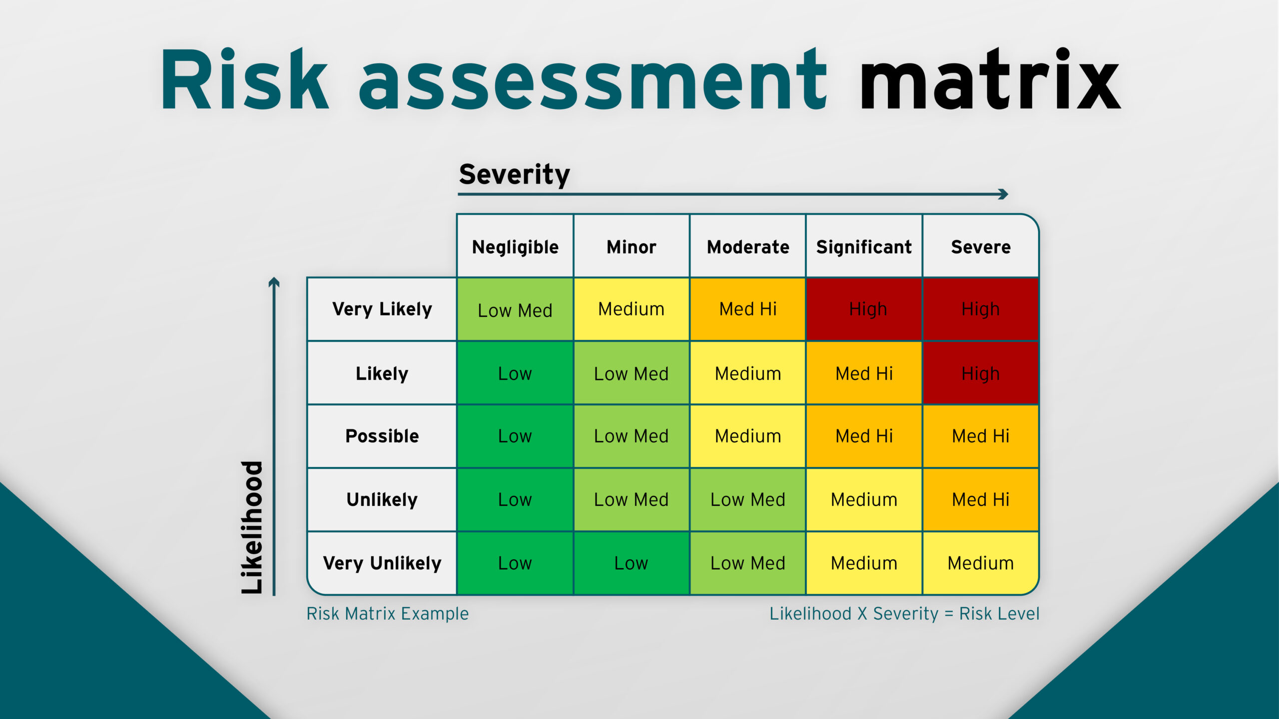
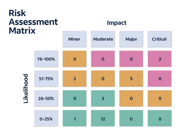
Monitoring project performance doesn’t simply spring up as an essential chore; it’s vital for successful project completion. So, you should know the risk assessment matrix.

Utilizing indices such as SPI allows project managers to simplify their evaluation process, by offering a precise, numerical representation of project progress. SPI in particular helps identify bottlenecks, promoting timely interventions which, in turn, mitigate excessive resource consumption and delay in completion.

By accurately evaluating project performance, managers pave the path for effective decision making. They are equipped with pointers for performance adjustments, if and when necessary, reducing the chances of unforeseen hurdles down the line. For example, an SPI of 0.75 may prompt the redirection of resources to meet deadlines, reinforcing the essence of timely monitoring in averting potential setbacks.

Calculating the Schedule Performance Index

Calculating the Schedule Performance Index

To delve deeper into the intricacies of Schedule Performance Index (SPI), understanding its calculation becomes crucial. It’s a quantitative process, grounded in a simple yet insightful formula.

The Formula Explained

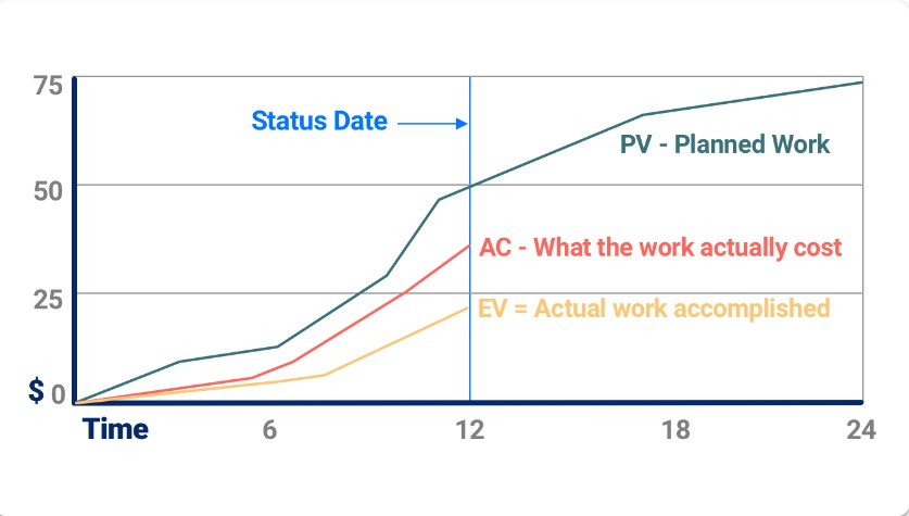
The nucleus of SPI calculation is a ratio. It’s expressed as the division of the Earned Value (EV) by the Planned Value (PV). Simply put, SPI equals EV divided by PV, or SPI = EV/PV. Both EV and PV are essential elements in project management.

Earned Value (EV), often termed Budgeted Cost of Work Performed (BCWP), represents the value of accomplished work up to a certain point in time. Meanwhile, Planned Value (PV), or Budgeted Cost of Work Scheduled (BCWS), symbolizes the allocated budget for specified work until a specific period.

This ratio provides professionals with rich insights into the project’s progress.

Example Calculation of Schedule Performance Index

Let’s illustrate the Schedule Performance Index calculation process using an example. If a project has a Planned Value (PV) of $200,000 for work scheduled within a specific timeframe, and the Earned Value (EV) from work performed during this period is $175,000, then:

SPI = EV / PV
SPI = $175,000 / $200,000

By computing this, one gets an SPI of 0.875. This value, being less than 1, indicates a project falling behind schedule. Conversely, an SPI greater than 1 signifies a project is running ahead of its planned schedule, while an SPI equal to 1 demonstrates the project is on schedule.

Remember, the value of SPI guides timely interventions, allowing effective decision-making, and preventing unnecessary wastages. Hence, its regular computation is an essential practice for successful project management, like operational readiness.

Interpreting the Schedule Performance Index

Interpreting the Schedule Performance Index

Interpreting the Schedule Performance Index, or SPI, offers valuable insights into the health of a project. By delving into the details of SPI figures, project managers gain the ability to make informed decisions. This understanding of SPI interpretation assists in identifying potential issues early and taking immediate action.

What Does an SPI Greater Than 1 Indicate?

An SPI greater than 1 offers a positive indication in the context of project timelines. It signifies that work is progressing at a faster pace than planned. Let’s consider an SPI of 1.2, for instance. In this scenario, earned value surpasses the planned value by 20%. However, don’t mistake a higher SPI as an indicator of cost efficiency. High SPI merely suggests better time resource utilization, not cost-effectiveness.

What Does an SPI Less Than 1 Mean?

On the contrary, an SPI less than 1 signals potential concern: the project lags behind the schedule. For example, an SPI of 0.8 shows that only 80% of the planned project work has been completed. Despite this red flag, remember not to panic. Instead, use these insights to analyze issues, identify underlying causes, and devise appropriate solutions to get back on track.

Schedule Performance Index and Project Health

Schedule Performance Index is a potent determinant of project health and should be regularly monitored. With an SPI of 1, the project is right on schedule, striking the perfect balance between expectations and reality. However, noting the Schedule Performance Index alone isn’t sufficient. Consider other performance metrics, such as the Cost Performance Index (CPI), to gain a comprehensive understanding of the project’s overall health.

I encourage project managers to use SPI to maintain an eagle-eye view of their projects, identifying potential hiccups, and implementing effective corrective measures to ensure successful project execution and timely completion.

Integrating SPI Into Project Management Practices

Integrating SPI Into Project Management Practices

My job here is to dive deeper into how Schedule Performance Index gets integrated into project management practices.

Setting Up Effective Baselines

Project baselines establish a yardstick against which SPI gets measured. The establishment of solid baselines is crucial, and they often form the foundation of SPI calculation. Including pivotal project parameters like cost, schedule, and scope in these baselines can lead to a more comprehensive Schedule Performance Index interpretation.

In essence, a baseline reflects the original project plan. An effective baseline captures the project’s scope in terms of deliverables and objectives, the project timeline detailing start and finish dates of tasks, and the outlined project budget.

To illustrate, let’s consider a project aiming to develop a new software feature. The deliverables would include both the software feature and the supporting documentation. The timeline might span several sprints or Phases, and the budget might allot resources for development, testing, and documentation personnel. The project baseline would then include these details, allowing SPI to reflect if the project is on track, ahead, or behind schedule accurately.

Continuous Monitoring and Adjustment

SPI’s effectiveness lies mostly in the frequency of its application. Regular monitoring of Schedule Performance Index allows project managers to identify potential scheduling issues early and take corrective action before the problems become significant.

An effective Schedule Performance Index monitoring practice includes periodic calculation typically at the end of every project phase or sprint, comparing the calculated Schedule Performance Index to the set project baseline, and interpreting the resulting value in terms of project performance.

For example, if a project was set to finish a phase within two weeks with an assigned budget, reaching only 75% completion at the end of two weeks would result in an SPI less than 1. This indicates the project is falling behind schedule and requires corrective actions. These could be anything from resource reallocation and additional hiring to process changes and scope reduction. Regular Schedule Performance Index monitoring thus enables project managers to make these adjustments promptly, ensuring the project stays on track and meets its objectives.

Maintaining a project’s health is a dynamic process and incorporating SPI into daily project management practices helps underpin the ever-changing landscape of a project’s progress.

Limitations and Considerations of Schedule Performance Index

The Schedule Performance Index (SPI), provides insights into how efficiently a project is progressing concerning its schedule. However, like any metric, it has its limitations and considerations. Here are some key points to discuss:

External Factors Affecting Schedule Performance Index

In the proper application of Schedule Performance Index, one must not neglect the influence of external factors. These elements, outside the project’s scope, often play a significant part in the actual performance in contrast to the planned value. Various elements such as unpredictable weather for construction projects, shifts in government regulations, market changes like sudden spikes in equipment costs, or unforeseen workforce disruptions become integral considerations.

For example, a planned project in the tech industry foresees a high Schedule Performance Index due to a well-structured plan and optimal resource allocation. But, if there’s a sudden change in market trends or tech regulations, the project might fall behind, causing a drop in Schedule Performance Index. Hence, while Schedule Performance Index holds crucial insights into a project’s temporal efficiency, it doesn’t account for the unpredictability of external factors.

Limitations in Forecasting Project Completion

Just as every coin has two sides, Schedule Performance Index, too, has its drawbacks when it comes to forecasting project completion. Primarily, SPI focuses on the past and present status of a project but struggles to predict the future effectively. Just because a project maintains an SPI greater than 1 does not guarantee its timely completion. Exemplifying, if a project shows an SPI of 1.5 during its initial phase, one can’t confirm that it’ll complete ahead of time, as upcoming tasks might be more complex and time-consuming.

Moreover, SPI fails to capture the true essence of project complexities. Projects composed of intricate and interdependent tasks often get misrepresented by SPI calculations. Herein, SPI might show a high value, providing a false sense of security about the project’s status. For instance, in software development projects, complex programming tasks may take longer than expected, lowering the SPI, even if previous tasks were efficient.

So, it’s essential to understand SPI’s limitations while striving for that optimal schedule performance. Supplementing SPI with other project management tools and continual context consideration facilitates a more accurate view of the project’s progress.

Best Practices for Improving Schedule Performance Index

Best Practices for Improving Schedule Performance Index

In the pursuit of improving the Schedule Performance Index (SPI), implementing a series of best practices proves beneficial. Focusing on proactive project planning, effective communication and stakeholder engagement, and utilizing software for schedule tracking can enhance your SPI significantly.

Proactive Project Planning

Proactive project planning lays the groundwork for significant impact on Schedule Performance Index. As a project manager, it’s crucial to generate a robust and realistic schedule during the planning phase. Taking into account the project’s scope, available resources, and potential risks in project management enables creation of a practical timeline. For example, when setting up a project timeline, ensuring contingencies for unforeseen delays minimizes the risk of falling behind schedule, thereby improving SPI.

Additionally, establish baselines for scope, cost, and schedule parameters during project planning. This, in turn, facilitates more precise tracking and control of project progress, paving the way for a more accurate SPI calculation over the duration of the project.

Effective Communication and Stakeholder Engagement

Engaging stakeholders effectively and maintaining open communication pathways represents another pivotal practice to improve SPI. Regular progress update meetings and timely briefings help in keeping everyone on the same page in terms of project status. For instance, discussing the SPI during stakeholder meetings ensures everyone understands if the project is ahead or behind schedule. This transparent sharing of project status often leads to a cooperative approach towards problem-solving, propelling the project towards its schedule targets.

Utilizing Software for Schedule Tracking

In today’s digital age, software solutions for schedule tracking are a must-have tool in a project manager’s arsenal to improve SPI. Prime examples of these solutions include Microsoft Project, Asana, and Trello. These platforms allow automated computation of SPI by inputting Earned Value (EV) and Planned Value (PV) values. The real-time tracking of scheduling deviations empowers project managers to swiftly identify issues and make necessary adjustments. Thus, leveraging such software can streamline project scheduling tasks, resulting in an improved SPI over time.

Conclusion

Understanding and effectively using the Schedule Performance Index can make a world of difference in managing your projects. Remember, it’s not just about calculating SPI; it’s about using this valuable metric to steer your project in the right direction. Proactive planning, clear communication, and stakeholder engagement are key to improving your SPI. Additionally, don’t underestimate the power of software tools. They can offer real-time insights and facilitate quick adjustments, keeping your project on track. So, don’t wait! Start putting these best practices into action and watch your SPI improve. After all, a healthy SPI is a clear sign of a project moving smoothly towards its goals.

Frequently Asked Questions

Q1. What is Schedule Performance Index (SPI)?

SPI, or Schedule Performance Index, is a tool used by project managers to effectively monitor the progress of a project. It’s calculated as a ratio of Earned Value (EV) to Planned Value (PV), and different values signify different project progress statuses.

Q2. What does SPI greater or less than 1 signify?

An SPI greater than 1 shows that the project is progressing ahead of its planned schedule. Conversely, if the SPI is less than 1, it indicates that the project is falling behind its intended schedule.

Q3. How can SPI be improved?

Improvement in SPI can be achieved through proactive project planning, effective communication with stakeholders, and leveraging software tools for schedule tracking. These steps ensure accurate progress tracking, better problem-solving approach, and prompt adjustment of scheduling deviations, respectively.

Q4. Why is it important to monitor SPI regularly?

To accurately assess project progress, it’s important to consistently monitor SPI. Regular tracking aids in detecting potential issues early, enabling timely remedial actions, and optimizing project performance.

Q5. What Software Tools are recommended for improving SPI?

Software tools like Microsoft Project, Asana, and Trello are recommended for improving SPI. These tools help in real-time scheduling deviation monitoring, thereby aiding in making prompt adjustments, which can, in turn, enhance SPI over time.

MoSCoW Method

MoSCoW Method: Top 10 Tools for Streamlined Project Management in 2024

Navigating the dynamic world of project management can feel like a daunting task. But, with the right tools and methodologies, it’s possible to streamline the process significantly. One such tool that’s been making waves in the industry is the Moscow method.

Born and bred in the bustling city of Moscow, this method is all about prioritizing tasks based on their importance and urgency. It’s a strategy that’s reshaping how businesses tackle projects, making it a hot topic for those in the know. So, let’s delve into the world of Moscow project management, exploring its ins and outs, and understanding why it’s become such a game-changer. Buckle up, because we’re about to take a deep dive into the heart of project management.

Understanding Moscow Project Management

Understanding Moscow Project Management

Stemming from the preceding context, it’s now time to delve deeper into MoSCoW project management. Knowing the origins and principles can provide valuable insights, enabling comprehensive understanding of its efficiency in streamlining processes.

The Origins of MoSCoW Methodology

The MoSCoW methodology, a brainchild of Dai Clegg, made its debut back in 1994. It’s an established fact that it was not born in Moscow, rather its name is an acronym that stands for “Must have, Should have, Could have, and Won’t have.” The methodology was brought to life while Clegg was employed at Oracle UK, aiming to provide a solution for handling project priorities in a user-centric way.

Core Principles of MoSCoW

The MoSCoW methodology operates on four primary regulations that guide the allocation and execution of tasks in a project.

  1. Must-have: These tasks form the backbone of a project. A project can’t function without including them. For instance, safety measures in a construction project.
  2. Should-have: These are important tasks but not as vital as must-have tasks. They contribute greatly to the project, but their absence doesn’t halt a project entirely. An example could be premium amenities in a residential construction project.
  3. Could-have: These tasks are desirable but not necessary. They are usually addressed if resources and time permit. For example, aesthetic enhancements to a project.
  4. Won’t-have: In the hierarchy of tasks, these fall into the lowest bracket. While they may hold some value, the project can move forward without their inclusion. This could be optional accessories or decorative items in a construction project.

Mastering MoSCoW project management involves comprehending these principles, and facilitating a holistic approach towards project completion based on priority. It paves way for effective results, keeping relevance and practicality in check.

The MoSCoW Method Explained

The MoSCoW Method Explained

When we think about project management, it’s valuable to understand how to prioritize tasks effectively. One method having stood the test of time is the MoSCoW methodology. It traces its origins back to Dai Clegg in 1994 and interprets the MoSCoW acronym as “Must have, Should have, Could have, and Won’t have.” Mastering this holistic approach to project management underscores the significance of prioritization for successful outcomes.

Must Have, Should Have, Could Have, Won’t Have

In the MoSCoW method, tasks get categorised into four sections: Must have, Should have, Could have, and Won’t have. This division fosters clear goal orientation and effective project planning.

‘Must have’ tasks represent the core elements of a project; without them, the project’s viability falters. For instance, in building a mobile application, creating an interactive interface qualifies as a ‘Must Have.’

‘Should have’ tasks, while important, are not as critical as ‘Must haves.’ They represent features that, if omitted, won’t spell disaster for the project. An example could be adding accessory features such as a dark mode for the app.

‘Could have’ tasks are desirable but not necessary. Their inclusion depends on extra resource availability. In our case, it might be the addition of custom ringtones to the application.

Finally, ‘Won’t have’ tasks denote requirements intentionally excluded from the current project timeline but might be reconsidered in future iterations.

Applying MoSCoW in Project Planning

Implementing the MoSCoW method in project planning starts with creating a prioritization list of tasks. Post initial creation, collaboration with stakeholders helps to finalize this list, ensuring everyone’s needs are considered.

Once finished, aligning resources against ‘Must have’ tasks takes precedence. ‘Should have’ tasks follow next, and if time and resources permit, ‘Could have’ tasks come into play. ‘Won’t have’ tasks are consciously sidelined for the specific project lifecycle.

During the project, constant review of these priorities helps in keeping the project on track and adjusting for any unexpected variables that may arise, demonstrating the continued relevance and usefulness of the MoSCoW technique in project management. Tasks categories in the MoSCoW method dynamically facilitate project management, aiding in delivering projects efficiently and promptly.

Benefits of Using Moscow Project Management

Benefits of Using Moscow Project Management

Following a methodical approach like the MoSCoW project management style offers numerous benefits. Let’s delve into each one in detail for further analysis.

Prioritization and Resource Allocation

One of the main benefits that I’ve observed with MoSCoW project management is the ability to prioritize tasks effectively. Applying this method helps to identify the tasks that are critical for project completion. For example, tasks categorized as ‘Must have’ are core functionalities that directly impact the project’s success. Hence, They always receive top priority.

Moreover, this method allows for efficient allocation of resources. It guides me towards dedicating more resources to ‘Must have’ and ‘Should have’ tasks. On the contrary, ‘Could have’ tasks receive resources only when the higher priority tasks are complete, ensuring that the allocation of resources aligns with the project’s priorities.

Improved Team Communication and Focus

MoSCoW project management also facilitates better team communication. When I use this method, it’s clear for everyone involved in the project what tasks are necessities, which are important but not vital, and which can be sidelined. This clarity fosters effective communication among team members, setting clear expectations for everyone involved in the project.

Moreover, the MoSCoW method keeps the team focused on the essential tasks first, improving overall efficiency. For instance, teams can concentrate on ‘Must have’ tasks before moving on to the ‘Should have’ and ‘Could have’ tasks. This focus not only speeds up project completion but also improves the quality of the work, as teams aren’t wasting time and energy on less important tasks.

All things considered, MoSCoW project management certainly brings a host of benefits, including effective prioritization of tasks, efficient resource allocation, clearer communication, and enhanced focus on the essentials.

Challenges and Limitations

Despite the numerous advantages of the MoSCoW method in project management, it’s not without its challenges and limitations. Here, we’ll discuss two significant hurdles: Identifying the right priorities and managing stakeholder expectations.

Identifying the Right Priorities

One main challenge lies in correctly identifying and categorizing tasks according to their importance. MoSCoW relies on a clear understanding of project goals, context, and constraints. If the project team doesn’t grasp these intricacies, misclassification of tasks may occur, leading to inefficient resource allocation. For instance, if a noncritical task is mistakenly labeled as a ‘Must have’, it diverts essential resources from truly critical tasks, risking the project’s success. In this case, minimizing the misclassification, which affects project efficiency, depends on the team’s expertise in aligning project objectives with tasks.

Managing Stakeholder Expectations

Another substantial hurdle is managing stakeholder expectations. Frequently, stakeholders have different views on task importance, potentially leading to a disagreement on the MoSCoW classifications. To illustrate, a stakeholder might view a particular feature as a ‘Must have’ while the project team deems it a ‘Could have’. This divergence can lead to conflicts and derail the project’s timeline. The key to navigating these choppy waters lies in effective communication and negotiation techniques. Truly effective MoSCoW project management requires not only understanding tasks but also aligning all stakeholders on their priorities.

Case Studies: MoSCoW in Action

Diving further into the MoSCoW method, let’s take a look at some real-brands examples. The case studies below demystify how MoSCoW operates in genuine project scenarios, showcasing positive results from varied industry sectors. Carefully examine the following stories and draw insightful inferences about MoSCoW’s practical utility.

Success Stories in Various Industries

Let’s say, in the marketing sector, the MoSCoW method, correctly applied, has generated stellar results. For instance, ABC Marketing Agency employed the model in one of their key projects. They were able to prioritize tasks effectively, leading to a fruitful project completion within the stipulated time. By distinguishing the ‘Must haves’ from ‘Should haves’, the team managed their resources wisely, resulting in a 15% increase in project efficiency.

Intriguingly, the Travel industry too has relished MoSCoW’s influence. XYZ Travel Company, dealing with year-round voyagers, assigned its tasks using the MoSCoW model. Successfully dividing their requirements into the four categories, the company noted a 25% surge in team productivity.

From software development to construction, numerous domains attest to MoSCoW’s practical effectiveness. However, as we’ve seen, it’s not just about getting it right; it’s about implementing it right.

Lessons Learned from MoSCoW Implementation

Reflecting on these successful instances, we see the golden rule of applying MoSCoW: Clear, defined priority categorization. Any ambiguity allows room for errors, turning into potential roadblocks in achieving the project goals.

A critical lesson echoes from the story of DEF Software Company. DEF learned the hard way about the consequences of misclassification of tasks. Initially struggling with an ambiguous understanding of ‘Must Haves’ and ‘Should Haves’, they faced issues in resource allocation. However, upon rectification, DEF experienced a considerable improvement in project execution.

Stakeholder communication forms the backbone of successful MoSCoW adoption. GHI Construction Company’s story underscores this. After dealing with conflicting views among stakeholders about task significance, GHI adopted an approach of consistent dialogue, clear agreement, and thorough documentation to ensure mutual understanding of task priorities.

Tools and Software for MoSCoW Project Management

Project management gets a boost of efficiency when it utilizes digital tools designed specifically for the MoSCoW method. These softwares reflect and support the ‘Must have, Should have, Could have and Won’t have’ classification system, adding a technological dimension to task prioritization and team collaboration.

Digital Solutions for Better Prioritization

Making full use of technology, some digital solutions stand out in their ability to improve the prioritization process in MoSCoW Project Management. Trello, for instance, allows for the creation of task cards that can be easily categorized into the MoSCoW classes and redistributed as priorities change. Jira does that too but goes a step further, offering features that track project development over time, with burn down charts and the like. Asana stands as another contender, providing an intuitive interface where tasks can be organized according to their MoSCoW classification.

Integrating MoSCoW with Agile Frameworks

Agile frameworks and the MoSCoW method don’t just fit together well—they complement each other in ways that become clear when digital project management tools come into play. With software like MS Project, the MoSCoW priorities can be incorporated into sprints with stunning efficiency. Even better, tools like Scrumwise allow MoSCoW classification to be integrated directly into their system—making possible a seamless fusion between Agile and the MoSCoW method. Through this integration, projects can be fluidly responsive to changes, exhibiting the full strengths and benefits of both MoSCoW and Agile.

Conclusion

So, we’ve journeyed through the MoSCoW method’s role in project management. We’ve seen how it shapes task prioritization, and the potential pitfalls to watch out for. We’ve explored digital tools that can streamline the process and the fusion of MoSCoW with Agile frameworks. It’s clear that when used effectively, the MoSCoW method can revolutionize project execution, making it more efficient and responsive. It’s not just about prioritizing tasks; it’s about creating a project management system that’s adaptable, efficient and geared towards success. The blend of MoSCoW and Agile is a powerful combination that can redefine the way we manage projects. So let’s embrace it and take our project management skills to the next level.

Frequently Asked Question(FAQs)

Q1: What is the primary focus of the MoSCoW method in project management?

The MoSCoW method primarily focuses on prioritizing tasks based on their urgency and importance. This prioritization can help enhance task allocation and increase the efficiency of project management.

Q2: How are tasks categorized using the MoSCoW method?

Tasks are categorized into four groups – “Must have, Should have, Could have, and Won’t have” – under the MoSCoW method.

Q3: What are some challenges faced when using the MoSCoW method?

Some challenges include potential misclassification of tasks, and managing stakeholder expectations can also be difficult.

Q4: How can digital tools be used to implement the MoSCoW method?

Tools like Trello, Jira, and Asana support task prioritization and team collaboration within the MoSCoW framework, making the application of this method more scalable and efficient.

Q5: How can the MoSCoW method be integrated with Agile frameworks?

The MoSCoW method can be incorporated into Agile frameworks by using tools such as MS Project and Scrumwise. These tools allow for integration of the MoSCoW priorities into sprints and other project management systems, therefore combining Agile and MoSCoW methodologies for effective project execution.

microsoft project management

Mastering Microsoft Project Management & Its Tools in 2024

Navigating the intricacies of project management can be a daunting task. But, with Microsoft project management tools, it doesn’t have to be. I’ve spent years exploring and mastering these tools, and I’m here to share my insights with you.

Whether you’re a seasoned project manager or just starting, Microsoft’s offerings can streamline your workflow and boost productivity. In this article, I’ll delve into the specifics, providing a comprehensive guide to leveraging Microsoft project management solutions.

Exploring Microsoft’s Role in Project Management

Exploring Microsoft's Role in Project Management

As someone who’s spent a considerable amount of time navigating through Microsoft project management tools, I’m well-equipped to delve deeper into the unique advantages these tools bring forth.

Microsoft Project Management: A Tool for Managers

Microsoft Project establishes itself as the go-to software for project management open source. This robust and sophisticated application stands out by offering features such as scheduling options, resource management functions, and portfolio management capabilities. As an illustration, the Gantt chart advantage allows for efficient timeline management, enhancing project planning by providing a colorful, easy-to-read visual of the project’s progress. The resource management function, on the other hand, enables the tracking of resource use and helps in optimal allocation, making sure that projects run smoothly without overusing or underusing available resources.

Integrating with Microsoft Teams for Collaborative Work

One of Microsoft’s smartest moves in recent times includes the integration of Microsoft Project with Microsoft Teams, a platform designed for collaborative work. This harmonization of two powerful tools brings about a unified system that fosters better communication and productivity among team members. Imagine sharing project timelines, tracking progress, and allocating resources all from Microsoft Teams’ dashboard. The ease of access is unparalleled! This not only streamlines workflow but also eliminates the hassles of switching between multiple applications, providing an all-in-one solution for microsoft project management needs.

Key Features of Microsoft Project Management Tools

Key Features of Microsoft Project Management Tools

In the realm of microsoft project management, Microsoft’s lineup of tools offers standout capabilities. Let’s examine the key features that set them apart.

Task Scheduling and Time Management

Top-notch capabilities define Microsoft’s approach to task scheduling and time management. Microsoft Project, for instance, boasts a robust Gantt chart view, enabling project managers to visualise every stage of a project in a linear timeline. Critical path methods, milestones, and predecessors form part of the available tools, adding layers of analysis and strategic planning. Project managers can also set task dependencies, ensuring project progress stays organized and systematic, by project management tool free.

Resource Allocation and Budget Tracking

A resilient system for resource allocation and budget tracking marks Microsoft’s suite of tools. Project managers can assign tasks to resources, identify over-allocations, and adjust accordingly. Moreover, a budget tracking feature provides an in-depth view of projected costs versus actual costs. This data feeds into effective financial management, aiding decision-makers to stay within budget and make necessary adjustments.

Reporting and Analytics for Decision Making

Microsoft Project’s reporting and analytics tools prove instrumental in decision-making processes. Real-time reporting offers immediate insights into project performance, presenting a mix of views from simple project status summaries to complex Earned Value Analytics. Power BI integration elevates this capability, enabling extensive data mining and interactive visualizations. It operates not only for reporting contextual data but also for fostering an environment favoring learned lessons and constant improvement.

Advantages of Microsoft Project Management Tools

Despite being trifling in number, the perks of Microsoft’s project management tools are expansive, extending beyond traditional aspects. These benefits collectively underscore Microsoft’s competency in augmenting project management, streamlining workflow, and fueling productivity.

Compatibility with Other Microsoft Office Products

One major advantage of Microsoft’s project management tools is their compatibility with other Microsoft Office products. They’re nimble allies of the likes of Word, Excel, and PowerPoint. Integrating these tools into the project management ecosystem amplifies efficiency, fostering a seamless workflow. For instance, project updates conceived in Microsoft Project can effortlessly morph into PowerPoint presentations, aiding in transparent status reporting. Similarly, harness insights sourced from Excel data are advantageous in tracking project performance or auditing resource allocation. This compatibility feature, thereby, reduces the need for switching between programs and minimizes redundancy.

Cloud-Based Solutions and Flexibility

Cloud-based solutions offered by Microsoft are another highlight, positioning the company as a powerhouse in modern project management. Installation woes, storage limitations, and geographical restrictions are no longer stumbling blocks. Tools like Microsoft Project and Teams, being cloud-based, offer flexibility and independence from location constraints. Employees can access data from anywhere, at any time – a quality that resonates especially with remote teams. Feature updates are also continual, which means that users always have the latest tools and improvements available to them.

Comprehensive Support and Resources

Microsoft’s comprehensive support and resources are a standout advantage in equipping subscribers for success. Microsoft customers receive access to a plethora of training materials, tutorial sessions, community forums, and round-the-clock customer service. These resources facilitate eficient navigation through the software and empower users to better utilize the wide array of features available to them. Thus, subscribers are never alone in their project management journey as Microsoft’s comprehensive support provides a steady hand to guide the way.

Comparative Analysis: Microsoft vs Other Project Management Software

Now, as we know about Microsoft project management, so we will do some comparative analysis between Microsoft and other project management softwares. So, let’s just delve into it:

User Experience and Interface

In terms of user experience and interface, Microsoft Project positions itself as a leader. This platform, as part of the Microsoft suite, utilizes a familiar layout and design. It’s intuitive, providing an easy-to-use interface. On the other hand, some project management software may come with aesthetically pleasing interfaces, yet they often pose a steep learning curve, especially for non-technically inclined team members.

Pricing and Subscription Models

Examining the pricing and subscription models, Microsoft Project provides various levels of subscription plans. They ensure affordability and value for businesses of all sizes. From basic task management features to comprehensive project planning tools, options are diverse. In comparison, other project management tools often provide similar pricing models. However, they sometimes lack the range of features that Microsoft offers for the same price category.

Customization and Scalability

Speaking of customization and scalability, Microsoft Project shows superior capabilities. It offers customizable reporting tools that enable businesses to build bespoke reports fitting their unique needs. Furthermore, this platform provides scalability to grow with the business requirements. Other project management software might also offer customization and scalability, but not to the extent or with the level of flexibility that Microsoft Project does. Thus, Microsoft establishes itself as a highly competitive choice in these aspects.

Real-World Applications and Case Studies

Real-World Applications and Case Studies

Digging deeper into the realm of Microsoft’s project management tools, let’s examine their practical applications across different industries and observe how they adapt to complex project demands.

Success Stories in Various Industries

Microsoft’s project management solutions shine in real-world scenarios. Various companies report significant improvements in workflow efficiency after implementing Microsoft Project. Notably, an IT firm realized a 20% increase in productivity after integrating Microsoft Project with Teams, linking tasks directly to chats and meetings. Moreover, a healthcare company streamlined resource allocation and scheduling, reducing project timelines through task automation.

In the manufacturing sector, a prominent automotive company employed Microsoft Project to manage extensive production lines. They experienced a 15% reduction in project implementation time after streamlining processes using Microsoft’s resource management features.

How Microsoft Tools Adapt to Complex Projects

Microsoft’s project management tools excel in handling complex projects. The adaptability of these tools derives from extensive customization options, allowing users to mold the software to fit specific project needs.

An energy company, facing challenges in managing large-scale infrastructure projects, tailored Microsoft Project to monitor critical paths and risk factors, enhancing project transparency and control. Meanwhile, a construction firm leveraged Microsoft Project’s integration with Power BI to generate real-time project status reports, optimizing decision-making processes, process of tendering.

Overall, Microsoft’s project management tools, spearheaded by Microsoft Project, prove their mettle in diverse industries, handling projects of varying complexity with aplomb. More than just a software package, they represent a transformative solution that businesses are embracing to drive efficiency and growth.

Conclusion

Microsoft’s project management tools, particularly Microsoft Project, are truly a game-changer. With its seamless integration with Microsoft Teams and compatibility with other Office products, it’s a powerful solution for businesses. Its user-friendly interface, flexible subscription plans, and robust reporting tools make it a cut above the rest. The case studies we’ve looked at show how these tools have transformed operations in IT, healthcare, and manufacturing sectors. They’ve boosted productivity, streamlined resources, and slashed project timelines. The ability to tailor these tools to fit different projects in diverse industries like energy and construction is another big plus. So if you’re looking to drive efficiency and growth in your business, Microsoft’s project management tools are well worth considering. They handle complex projects with ease, proving their mettle time and again.

Frequently Asked Questions

Q1. What key features does Microsoft Project management offer?

Microsoft Project offers powerful project management capabilities, including task scheduling, cost forecasting, and resource management. It further presents advanced analytics for informed decision-making. The tool is enhanced by its seamless integration with Microsoft Teams, enhancing collaboration and communication.

Q2. How does Microsoft Project management compare to other project management software?

Microsoft Project stands out due to its user-friendly interface, flexible subscription plans, comprehensive reporting tools, and scalability. While similar tools may offer some of these features, Microsoft Project provides a comprehensive suite that caters to diverse project complexities and sizes.

Q3. How has Microsoft project management tools been applied in real-world situations?

Microsoft’s suite has been effectively employed across different industries. It’s been seen to increase productivity in IT companies, streamline resource allocation within healthcare environments, and reduce project timelines in the manufacturing sector.

Q4. Can Microsoft project management tools be customized for different industries?

Absolutely, Microsoft project management tools can be customized to manage projects specific to different sectors, such as energy and construction, allowing for tailored solutions that adjust to variable industry demands.

Q5. Are Microsoft project management tools cloud-based?

Yes, Microsoft offers both on-premise and cloud-based solutions to meet different needs, providing teams with the flexibility to work and collaborate from any location.

Q6. What support resources does Microsoft offer for its project management tools?

Microsoft provides varied support resources, including user manuals, online tutorials, forums, and a dedicated customer support team. These resources enhance users’ experience and facilitate problem-solving.

Q7. How do Microsoft project management tools contribute to business growth?

By enabling efficient project management and streamlined operations, Microsoft tools can significantly enhance productivity and reduce project delivery times, ultimately contributing to business growth and improved efficiency.

Standard operating procedure

Top 10 Best Standard Operating Procedure Templates for 2024

If you’ve ever been tangled in the web of operational chaos, you’ll know the value of a well-structured Standard Operating Procedure (SOP). It’s the secret sauce that keeps businesses running smoothly, ensuring every task is executed with precision and consistency.

In this article, I’ll dive deep into the world of SOP templates, shedding light on why they’re crucial for your business and how they can transform your operations. Whether you’re a small business owner, a manager in a multinational corporation, or an aspiring entrepreneur, this piece will guide you through the nuances of creating an effective SOP template.

Understanding Standard Operating Procedures (SOPs)

Understanding Standard Operating Procedures

In the corporate world, the phrase “Standard Operating Procedure,” often abbreviated as SOP, isn’t uncommon. I’ll introduce you to its meaning, importance, and essential elements.

The Importance of SOPs in Business Efficiency

SOPs, in a nutshell, serve as detailed, step-by-step instructions intended to guide employees through complex tasks. They’re instrumental in fostering a clear understanding of how various tasks should be executed, eliminating any possibility of confusion.

One cannot underscore enough the relevance of SOPs in augmenting business efficiency. Given their prescriptive nature, SOPs virtually erase the likelihood of executional errors, ensuring tasks are performed correctly the first time. Businesses find SOPs particularly useful in staff training, as they clearly delineate procedures and enable swift onboarding. They also avow consistency in task execution, regardless of who’s performing the task. In a nutshell, SOPs pave a robust pathway toward enhanced productivity, reduced training time, and standardized work processes within the organization.

Essential Elements of an Effective SOP

For an SOP to straddle efficacy, it must comprise certain crucial components. These commonly include:

  • Title: Capturing the topic of the procedure at hand.
  • Purpose: Outlining why the procedure is necessary.
  • Scope: Defining where the procedure applies.
  • Procedure: Detailing the method of execution.
  • Roles and Responsibilities: Identifying who’s in charge of implementing the procedure.
  • Review and Approval: Indicating who’s responsible for overseeing and validating the SOP.

In essence, an optimal SOP revamps an organization’s operational effectiveness by reducing errors, inducing standardization, accelerating employee training, and promoting workplace safety. Each of these benefits, in turn, generates a surge in overall business efficiency. Therefore, crafting and utilizing SOPs isn’t just desirable but indispensable for corporate success.

With a good grasp of SOPs, we can venture into creating effective standard operating procedure templates. Remember, the key to a successful SOP starts with a clear, concise, and accurate template. So, stay connected as we delve deeper into the world of SOP templates in the upcoming sections.

Exploring Standard Operating Procedure Templates

Exploring Standard Operating Procedure Templates

Continuing from the previously elaborated concept of the importance of SOPs, let’s dive into understanding a pivotal tool for creating competent SOPs – SOP templates. A key element in providing operational consistency, SOP templates offer a strategic framework for task execution. They significantly simplify the process of writing SOPs, implicitly enhancing business efficiency.

Benefits of Using a Template for SOP Creation

While drafting SOPs from scratch can be daunting and time-consuming, SOP templates offer a comfortable starting point. By using a thoughtfully designed template for SOP creation, businesses can save time and eliminate the possibility of missing out on crucial elements. A well-structured template helps in maintaining consistency, thereby reducing the chances of operational hiccups.

Additionally, templates facilitate SOP compliance by encompassing all key elements such as title, purpose, scope, roles and responsibilities, procedure, and review process. Thus, using templates not only simplifies but also optimizes the creation and execution of SOPs, leading to increased efficiency and productivity.

Key Features to Look for in SOP Templates

While exploring SOP templates, certain characteristic features stand out as essential for optimal use. A practical SOP template usually includes sections for the title, document number, and version for easy identification and tracking.

The template typically outlines the purpose and scope of the SOP, providing clear indications about when and where the procedures apply. Additionally, precise descriptions of procedural steps, roles, and responsibilities are integral parts of a competent template. It’s also worth noting to look for a review and approval section, as it ensures that the SOP is verified and approved by the relevant authorities.

Furthermore, an ideal SOP template incorporates a change control section to document revisions, enhancing transparency and accountability. Lastly, don’t overlook sections for supporting documents and references, as they add credibility and comprehensiveness to the SOP.

By thoughtfully selecting an SOP template that includes these features, businesses can bolster their operational efficiency and consolidate processes. With this enhanced understanding of SOP templates, their benefits, and key features, let’s move forward with a more in-depth examination of their application in various business sectors.

The Process of Customizing Your SOP Template

The Process of Customizing Your SOP Template

So, we now know what Standard operating procedure is, its benefits, key features, and importance of using SOP template. Now we will look into the process of customizing SOP template.

Identifying Your Business Needs

In customizing your SOP template, the first step involves identifying your business needs. By pinpointing the what, why, and how of your organization’s operations, you focus on the specifics that resonate with your company’s mission and objectives. Factors like operational strategy, the nature of tasks performed, and the requirements set by governing authorities play crucial roles in this phase. For example, a healthcare facility must prioritize patient safety, regulatory compliance, and the regular updating of SOPs due to constantly evolving medical practices.

Incorporating Branding and Organizational Culture

Following identification of your needs, comes the incorporation of your business’s unique brand and organizational culture into your SOP template. It’s important not merely to include the practical information about your procedures but also to reflect your company’s identity. Start by integrating your company’s logo, colors, and typography into the template design. Provide guidance on your business’s tone of voice and communication style, beneficially in written procedures. For instance, if your organization fosters an environment of open communication and team collaboration, this can be reflected in your SOPs by encouraging team-based problem-solving approaches in given procedures.

Another important aspect is mirroring your company’s values and ethos in your SOPs. An eco-conscious company might stress energy-saving procedures or recommend digital documentation to save paper. By tailoring your SOP templates to reflect your specific branding and culture, you strengthen the connection between your staff and your company and reinforce the company’s direction and principles.

Best Practices for Implementing SOPs

Best Practices for Implementing SOPs

In this article, we’ll delve into the effective ways of implementing SOPs within your organization. Bear in mind that creating SOPs using templates is only the initial step. To capitalize on the full benefits of SOPs, businesses must train their staff, monitor SOPs, and ensure they’re frequently updated.

Training Your Team on SOP Usage

Training the staff is crucial for SOP implementation. I recommend arranging comprehensive sessions to familiarize your team with the new SOPs.

Conduct Interactive Training

Engage the workforce through interactive training. Role play, for example, helps to comprehend the salient SOP features, assists in anchoring the know-how into routine work, and promotes engagement.

Use Visual Aids

Visual aids, such as infographics, diagrams, and flowcharts, alleviate understanding. They provide an overview of the process’s flow, making SOPs easier to follow.

Consider Refresher Trainings

Training shouldn’t be a one-time event. Let’s consider conducting refresher courses regularly, reinforcing the SOP information and ensuring knowledge retention.

Monitoring and Updating SOPs Regularly

As your business evolves, your SOPs may encounter obsolescence. The key lies in regular monitoring and updating.

Monitor SOPs for Effectiveness

Regular tracking is pivotal for determining efficiency. The introduction of performance indicators and metrics into our SOPs allows accurate evaluation.

Keep Updating SOPs

Change is an integral part of business dynamics. Always revise and update the SOPs to reflect changes in procedures, technologies, or regulations.

Encourage Feedback

Don’t overlook the input of those who are routinely employing the SOPs. Encouraging feedback from employees gives invaluable insights for SOP enhancement.

Such practices in implementing SOPs not only ensure efficiency and precision but also cultivate an environment of continuous improvement in your workplace.

Industry-Specific SOP Template Considerations

Industry-specific SOP templates cater to unique requirements of different sectors. Whether it’s manufacturing, service, or healthcare, a well-tailored SOP template can elevate standardization and ensure operational efficiency.

Manufacturing Industry Templates

In the manufacturing realm, templates can mitigate risks and fortify compliance with regulatory standards. They can facilitate line-balancing, minimize job setup times and improve machine utilization rates. For instance, an Equipment Operation SOP template outlines logical, repeatable steps to ensure optimal functioning of sophisticated machinery. On the other hand, a Material Handling SOP template illustrates appropriate techniques for safe and efficient movement of products within the facility.

Service Industry Templates

Service sectors, from hotels to IT companies, can benefit from dedicated SOP templates. They streamline tasks such as customer service, technical troubleshooting, and project management charts. For example, a Room Cleaning SOP template in a hotel provides detailed guidelines for housekeeping staff, enhancing customer satisfaction. Similarly, an IT Support Resolution SOP template simplifies the process of addressing and resolving client’s technical issues, boosting service efficiency.

Healthcare Industry Templates

SOP templates bear significance in the healthcare sector, too, ensuring patient safety and optimal medical outcomes. Templates guide tasks like patient intake, emergency response, and surgical procedures. A Patient Admission SOP template, for instance, enlists steps for efficient and empathetic care during the admission process. Another example, an Emergency Response SOP template sets out clear pathways for medical staff to handle emergencies, thereby aiding quick and accurate decision-making.

Selecting the Right Software for SOP Management

Selecting the Right Software for SOP Management

An essential part of enhancing operational efficiency involves choosing effective software for Standard Operating Procedures (SOP) management. Individual needs, industry specifications, scalability, and user-friendliness constitute some primary considerations. From personal research and industry expertise, I aim to guide you through this challenging task in the following sections.

Criteria for Choosing SOP Software

In pursuing the perfect match, I propose focusing your attention on a few critical points. Notably, these include:

  • Specific Needs Fulfillment: Target a program that meets your unique business demands. For a chemical company, for example, the software, such as ms project software, must comply with safety and environmental regulations.
  • Ease of Use: Opt for software that non-tech staff members can make use of without any burdensome training. Adoption challenges, in the context of a hospital, could put patients’ lives at stake.
  • Scalability: As your business grows, so must your SOP software. Thus, a system that handles an increase in operations, like processing more customer orders in a retail store, proves to be a valuable asset.
  • Integration Capability: Consider software that integrates seamlessly with your current tech stack. Retail giants, for example, benefit more from a system that blends into their existing CRM and project management platform.

Popular Tools for SOP Template Management

Several tools reign supreme in the SOP management space, based on wide usage and positive feedback. Your choice should hinge on a tool’s alignment with your unique needs. Below are a few favorites:

  • Process Street: Known for its user-friendly interface and extensive template library, it’s a hit with businesses across a range of industries. Fashion houses, for instance, employ it to streamline routine design processes.
  • SweetProcess: Its robust features, including custom workflows and step-by-step SOP guides, make it a preferred choice for companies requiring detailed procedure management, like large scale bakeries.
  • Tallyfy: This tool is lauded for its automation capabilities, a boon for firms yearning for process efficiency. Car manufacturers, for instance, utilize Tallyfy for seamless assembly line function.

Choosing the right software for SOP management demands introspection into your business’s specific needs and a thorough grasp of available tools.

Conclusion

It’s clear that SOPs are the backbone of efficient operations. They streamline task execution, minimize errors, and simplify staff training. SOP templates, tailored to specific industries, further boost standardization and efficiency. But remember, it’s not just about having SOPs; it’s about managing them effectively. That’s where SOP management software comes into play. Whether it’s Process Street, SweetProcess, or Tallyfy, the right tool can make all the difference. But don’t forget to align this choice with your unique business needs. It’s not a one-size-fits-all scenario. So, take the time to understand your requirements, evaluate various software options, and choose wisely. Because when it’s about operational efficiency, every detail counts.

Frequently Asked Questions

Q1. What are Standard Operating Procedures (SOPs)?

Standard Operating Procedures (SOPs) are a set of step-by-step instructions created to help workers carry out routine operations. SOPs aim to achieve efficiency, quality output, and uniformity of performance while reducing miscommunication and failure to comply with industry regulations.

Q2. How are SOPs beneficial for operational efficiency?

SOPs enhance operational efficiency by providing clear guidelines for task execution, which reduces errors and inconsistency. It aids in effective staff training, ensuring employees understand their roles and responsibilities better.

Q3. What is the role of SOP templates in various sectors?

SOP templates play a crucial role in standardizing processes across various sectors, including manufacturing, service, and healthcare. These templates help in maintaining consistency, enhancing productivity, and meeting industry-specific requirements.

Q4. How to choose the right SOP management software?

Choosing the right SOP management software depends on multiple factors like business-specific needs, ease of use, scalability, and its ability to integrate with existing systems. It should align with your unique business requirements.

Q5. What are some popular tools for SOP template management?

Popular tools for SOP template management include Process Street, SweetProcess, and Tallyfy. These tools are widely recognized for their user-friendly interfaces and customization capabilities.

Project Management Charts

Project Management Charts for Effective Project Planning

Ever felt like you’re juggling too many tasks at once? You’re not alone. In the complex world of project management, it’s easy to get overwhelmed. That’s where project management charts come in. These visual aids can be a game-changer, helping to streamline processes, improve team communication, and keep your project on track.

From Gantt charts to PERT diagrams, there’s a wide array of Project management charts to choose from, each with its unique benefits. But how do you know which one to use? Don’t worry, I’ve got you covered. I’ll guide you through the maze, helping you find the perfect chart for your project needs. So, let’s dive in and start making sense of project management charts.

Understanding Project Management Charts

Understanding Project Management Charts

Project Management Charts simplify the task of managing intricate projects. They offer a visual representation of schedules, tasks, and progress, making crucial project details easy to understand.

The Role of Charts in Project Management

Charts serve as an integral part of project management. Acting as visual aids, they provide a clear picture of the tasks, responsibilities, and deadlines. They act as reference points for project teams, aiding in tracking progress, identifying bottlenecks, and maintaining organizational flow. For instance, depictions of task timelines keep team members accountable, ensuring deadlines are met.

Types of Project Management Charts

Just like phases of project management, there are numerous charts which cater to different aspects of project management. Some commonly used ones include:

  • Gantt Chart: Visualizes the project schedule. It outlines the initiation and completion of tasks, allocating proper timeframes (E.g., Task 1 starts on Jan 1 and ends on Jan 15)
  • PERT Diagram: Shows the dependencies among tasks. This is ideal for understanding the sequence in which tasks need completion (E.g., Task 2 can’t start until Task 1 finishes)
  • Kanban Board: Focuses on workflow visualization. It places tasks as they move through stages of completion (E.g., “To Do”, “In Progress”, “Done”)
  • Burndown Chart: Reveals the rate at which the team is completing tasks. It’s useful when needing to gauge remaining work (E.g., 10 tasks remaining out of 20)

These charts, each with its unique strengths, provide an effective method for managing tasks. The choice depends on the specifics of the project and the team’s preference.

Gantt Charts: The Cornerstone of Project Planning

Gantt Charts: The Cornerstone of Project Planning

Moving from general project management charts, let’s narrow our focus to Gantt charts. These are considered a staple in project management, often revered as the cornerstone of project planning.

What is a Gantt Chart?

A Gantt chart, named after Henry Gantt who refined this powerful planning tool in the 1910s, is a horizontal bar chart used in project management. It visualizes the entire project schedule, displaying the start and finish dates of the terminal elements and summary elements of a project. Terminal elements and summary elements comprise the work breakdown structure of the project, allowing me to create a precise timeline for each task involved.

This type of chart integrates task sequences, durations, deadlines, and resources, making it easier to coordinate all the work. The left-hand side typically lists the task names, while the bars on the right provide a visual representation of their planned duration.

Advantages of Using Gantt Charts

Gantt charts hold a revered spot in project management for good reasons. Here are a few advantages of Gantt Charts:

  1. Visual simplicity: Gantt charts turn complex information into an easy-to-read visual format. Everyone on the team gets a quick, clear idea of the project timeline, roles, and tasks.
  2. Real-time progress tracking: With a Gantt chart, I can track project progress in real-time. Any shifts in task timelines or delays get displayed immediately, helping to identify potential bottlenecks swiftly.
  3. Improved planning and coordination: These charts allow efficient planning of resources and time. They also facilitate better team coordination, as every team member can see how their tasks align with others and understand the impact of any change.
  4. Enhanced communication: Gantt charts serve as a visual communication tool that aids in setting realistic expectations for stakeholders and keeps all involved parties informed about the project status.

Through these advantages, Gantt charts prove their indispensability for strategic planning, efficient project execution, and regular progress tracking. Their ability to simplify complex projects into manageable, visually apparent tasks makes them an unbeatable choice in project management.

Kanban Boards: Visualizing Workflow

Kanban Boards

Transitioning from Gantt charts, we now turn our focus to another popular project management tool: Kanban Boards.

The Basics of Kanban

Originating from Japan, Kanban holds its roots in industrial production, specifically automotive manufacturing. However, it’s not tied down to manufacturing, as it’s flexible enough for any project task, big or small. Simply put, a Kanban board is a visual workflow tool consisting of columns and cards. Each column represents a stage of work, for instance: “To Do”, “In Progress”, and “Done”. Meanwhile, the cards represent tasks, moving from one column to another as work progresses.

All tasks on a Kanban board are visible, providing a snapshot of the project’s status. The board aims to identify bottlenecks in the project workflow, enabling quicker reaction times, faster problem-solving. That’s the basic understanding of Kanban, a simple yet powerful tool that promises to streamline project workflows, making them more productive and efficient.

How Kanban Boards Benefit Project Teams

Project teams find Kanban boards incredibly helpful. They offer numerous benefits on multiple levels. For starters, they grant total visibility of projects, displaying all tasks in one view – a key element in effective project management. This transparency enables team members to see workload allocation, ensuring a balanced distribution among team members. It helps to ensure no team member is over or underwhelmed with tasks, giving fair chances to everyone.

Next, Kanban boards improve communication and collaboration among team members. The visual nature of Kanban makes it easier to discuss and assign tasks, acknowledging what everyone is working on, and reducing potential misunderstandings.

Thirdly, it adapts to change. Unlike project management methods that require fixed timelines, Kanban eases making updates or changes on-the-go, allowing team agility.

The last but not least, it encourages continuous improvement. By identifying bottlenecks, teams can optimize their processes. Teams tend to make small, continuous changes that lead to significant improvements over time.

In sum, Kanban boards aren’t just visually appealing tools. They are robust project management tools that offer transparent work visualization, improve communication, adapt to changes and foster continuous improvement.

PERT Charts: Simplifying Complex Projects

PERT Charts

After breezing through the dynamic Kanban boards, we now turn our attention to another project management marvel, the PERT chart. Deploy this chart and behold as it unwinds the intricacies of your complex projects.

Defining PERT Charts

A Program Evaluation and Review Technique (PERT) chart is an intuitive visualization tool in project management. It maps out all the pivotal tasks within a project and the dependencies between them. The PERT chart, in essence, features circles called nodes, representing the project tasks. Arrows link these nodes, illuminating the sequence of tasks and their integration. However, it’s the flexibility of these charts that sets them apart; they categorically address the reality of project uncertainties.

PERT charts also authenticate three estimates for each task: optimistic, pessimistic, and most likely. This trio forms the foundation for projecting the probable completion time for each task and, in turn, the entire project. My recommended sources for learning more about these estimates are the Project Management Institute (PMI) or the Association for Project Management (APM).

When to Use PERT Charts in Project Management

Onto the prime question: When should you unfurl the PERT chart in your project management arsenal?

Applying PERT charts generally makes sense when you’re navigating a complex project riddled with numerous interdependent tasks. These charts prove to be the guiding light when the timeline of a project is uncertain, or when a project involves unfamiliar territories where it’s hard to provide exact time estimates.

Moreover, under scenarios when a detailed analysis of task sequences and their dependencies is required, PERT charts reign supreme. They shine in their ability to identify critical paths in a project, enabling a clearer focus on those tasks that directly affect the project’s completion time.

In essence, PERT charts can be the compass guiding you through the wideness and wildness of complex project management. Explore more about the practical applications of PERT charts through portals like the Project Management Journal or the Journal for Quality and Participation.

By utilizing these guidelines for using PERT Charts, one can become adept at handling even the most complex of projects.

Critical Path Method (CPM): Timing Your Tasks

Critical Path Method (CPM)


Following the exploration of PERT charts, you might wonder what’s next on the list of project management essentials. Step up to the plate, the Critical Path Method (CPM), another powerful tool. In the realm of project management charts, CPM emerges as a clear go-to when looking to nail down precise project timelines. CPM charts show how tasks in your project overlap and depend on one another, allowing you to identify the “critical path”. So, let’s delve deeper and unravel the underlying principle of CPM and explore its integration with other project management tools.

The Principle Behind CPM

CPM, like PERT charts, examines dependencies between tasks. However, it’s in time-related specifics that CPM shines. CPM deduces the shortest possible time necessary to complete a project. It does this by calculating the longest sequence of dependent tasks, otherwise known as the “critical path”. The effectiveness of CPM, despite project complexity, depends on its three pillars: identification of all required tasks, sequencing of these tasks, and estimation of time each task takes.

Let’s say a project consists of five tasks. Task 1 takes three days, Task 2 and 3 take two days each, while Task 4 and 5 take four days each. Combined, these tasks take a total of fifteen days. However, taking interdependencies into account, you figure that tasks 2 and 3 can’t start until task 1 finishes, and task 5 can’t proceed until both tasks 4 and 2 complete. So, the more extended, critical path consists of Task 1 then Task 2, and finally Task 5, taking nine days, not fifteen. You’ve just applied the principle of CPM.

Integrating CPM with Other Project Management Tools

CPM doesn’t exist in isolation. In fact, it harmonizes effectively with other project management tools, such as Gantt charts and Kanban boards. Integrating CPM in Gantt charts, which depict project schedule, can yield a more effective visualization of project timeline, spurring project success.

Moreover, CPM complements nicely with Kanban boards too. While Kanban boards focus on task statuses, CPM gives a detailed timeline view. Therefore, project managers can use CPM and Kanban boards together for a comprehensive view of project tasks and their timing, crucial for efficient resource allocation.

Remember, each tool has its strengths, and selectively pairing them based on your project’s unique needs can optimize project management efficiencies. CPM, therefore, isn’t just another arrow in your quiver—it’s a game-changer when perfect timing matters.

Burndown Charts: Tracking Project Progress

Burndown Charts

Just as CPM serves as a crucial asset for perfect timing in project execution, Burndown charts act as a powerful project management tool, primarily in the Agile methodology. They track project progress in an easy-to-understand graphical representation.

Understanding Burndown Charts

A Burndown chart gets its name from its graphical representation. As tasks get completed, they “burn down” to zero, and that reduction over time gets depicted graphically. In essence, a Burndown chart is a visual portrayal, featuring a downward slope that depicts the amount of work left in a project versus time.

It’s simple to read a Burndown chart. The vertical axis represents outstanding work while the horizontal axis signifies time. A line starting from the top left, sloping down to the bottom right, illustrates the work getting burned down over time. An ideal Burndown chart line continues in a straight, downwards path, suggesting that work gets finished at a consistent rate. Irregularities in the line’s slope might indicate roadblocks or inefficiencies in the project’s process.

Utilizing Burndown Charts for Agile Projects

For Agile projects, Burndown charts offer valuable insight. They provide real-time tracking of work done versus the planned schedule. This benefit aids teams in identifying whether they’re ahead, on track, or lagging behind on their sprint tasks.

In Agile Scrum, sprints usually last for two weeks or a month. Teams plan the tasks they aim to complete during this time. Hence, Burndown charts become an instrumental tool for constant reevaluation, allowing teams to readjust their work strategies if they’re not aligning with planned progress.

For example, if the line on the Burndown chart appears flat for a few days, it means that no tasks have been completed during this period. In this scenario, the team would reassess their dynamics and find a solution to get back on track.

Overall, Burndown charts prove their worth in numerous ways. Not only do they depict work-progress over time, but they also highlight problem areas, enabling teams to make necessary changes swiftly to ensure project completion within the set timeline.

Choosing the Right Chart for Your Project

With various project management charts like Gantt, Kanban, PERT, CPM, and Burndown, each offering different visualization capabilities and benefits, it becomes vital to pick the right chart for your project. In this article, let’s explore how to choose the right chart and the factors to consider.

Factors to Consider

To choose the right chart for your project, consider four key factors: the project’s complexity, your team’s familiarity with the chart, the planning methodology you’re following, and your project’s changing needs.

  1. Project Complexity: For simple projects, a Gantt chart or a Kanban board works well as they provide a straightforward visual representation of task statuses. In contrast, for more complex projects with interdependent tasks, a PERT chart or CPM might prove useful.
  2. Team Familiarity: The effectiveness of a chart depends heavily on the team’s familiarity with the chart style. For instance, Agile teams often find Burndown charts intuitive, while teams new to project management might prefer the simplicity of a Kanban board.
  3. Planning Methodology: Your project planning methodology often dictates the type of chart you’ll use. If you’re following the Agile methodology, a Burndown chart suits perfectly. Conversely, if you’re using the critical path method, a PERT chart is ideal.
  4. Changing Project Needs: Your project’s needs might change over time; hence the flexibility of a chart plays a key role. In situations where the project scope varies frequently, a Gantt chart with its ability to represent dependencies and timeline changes can be beneficial.

Comparing Chart Effectiveness

Direct comparison of the effectiveness between charts can be challenging, given the different features and benefits they offer. Let’s highlight two of them — Gantt charts and Kanban boards.

  1. Gantt Chart: Known for its time management capabilities, a Gantt chart is ideal for projects where task scheduling is essential. It provides a timeline for the whole project, showing exactly when each task should start and finish, making it easy to identify dependencies and overlapping tasks.
  2. Kanban Board: With its easy-to-understand visual layout, a Kanban board is excellent for workload management. It enables teams to visualize the workflow, identify bottlenecks, and limit work-in-progress, thereby improving productivity.

The choice between project management charts, therefore, comes down to the specific needs and characteristics of your project. You must weigh the pros and cons of each chart relative to your project’s specific demands to choose the right one. Remember, a chart that works well for one project might not for another. Flexibility, therefore, is key in your choice.

Conclusion

Project management charts aren’t just pretty visuals – they’re vital tools for managing complex projects. Whether you’re using a Gantt chart for precise time management or a Kanban board for effective workload management, it’s clear that the right chart can make all the difference. The Critical Path Method is another powerful tool, especially when integrated with other charts for enhanced visualization. But remember, there’s no one-size-fits-all solution. Your choice should depend on project complexity, team familiarity, planning methodology, and changing needs. So, don’t be afraid to be flexible and select a chart that truly aligns with your project’s requirements. After all, the goal isn’t to use the most popular chart – it’s to deliver successful projects.

Frequently Asked Questions

Q1. What are the primary project management charts discussed in the article?

The article broadly discusses three types of project management charts – Gantt charts, Kanban boards, and PERT charts. Additionally, it speaks about the Critical Path Method (CPM) as an essential tool in project management.

Q2. How does the Critical Path Method (CPM) enhance project management?

CPM aids in determining precise project timelines by identifying a project’s critical path. It integrates with other project management tools to improve project visualization and efficiency, thereby streamlining the overall project management experience.

Q3. What factors should be considered when choosing a project management chart?

Factors such as the project’s complexity, team familiarity with particular charts, planning methodology used, and the ever-changing needs of the project are imperative when choosing a project management chart.

Q4. How do Gantt charts and Kanban boards differ in their effectiveness?

While both are essential project management tools, they offer different benefits. Gantt charts are particularly useful for time management, providing a clear timeline for project tasks. On the other hand, Kanban boards significantly aid in workload management by helping to balance tasks across team members and prevent overwork.

Q5. Why is flexibility important in the selection of charts?

Flexibility in chart selection is essential due to the dynamic nature of project management. The most suitable chart may change as a project evolves, hence the need to select a chart that can adapt and align with the project’s requirements.

Event Planning Templates

Master Event Planning in 2024: Easy Steps to Crafting the Best Event

Planning an event isn’t a walk in the park. It’s a complex process that requires meticulous attention to detail, organization, and time management. But what if I told you there’s a tool that can simplify this process and save you from potential headaches? Enter: the event planning template.

An event planning template is your secret weapon for seamless event management. From budgeting to scheduling, it’s the roadmap that guides you through the labyrinth of event planning. Whether you’re a seasoned event planner or a newbie, you’ll find this tool invaluable.

Understanding Event Planning Templates

Understanding Event Planning Templates

Building upon the concept introduced earlier, let’s delve deeper into the functionality and significance of event planning templates. They act as the backbone of successful event management, streamlining the complexities and offering a systematic platform for organization.

The Purpose of Using Templates in Event Planning

The purpose of using templates in event planning is twofold. First, they enhance efficiency by providing a structured framework for the myriad tasks involved in planning an event. Second, they reduce the possibility of oversight, indicating a clear timeline for task execution.

For example, when organizing a corporate fundraiser, an inherent multitude of tasks – from contacting potential sponsors, coordinating with the venue, to publicizing the event – demands meticulous organization. Here’s where an event planning template comes in handy. It breaks down these tasks into manageable chunks, outlines deadlines, and assigns responsibilities.

Templates also minimize the risk of forgetting important aspects. If you’re organizing a wedding, you wouldn’t forget to book a caterer or florist because it’s all there in your template, acting as a comprehensive checklist.

Core Elements of an Event Planning Template

Core Elements of an Event Planning Template

Meanwhile, let’s demystify what constitutes an event planning template. Various elements converge to form such a template, each playing a crucial role.

  1. Objective: Clear objectives hold the event together, providing a vision for the forthcoming tasks. For instance, promoting a new product or fundraising for a charity.
  2. Timeline: A detailed timeline facilitates smooth progress, specifying when each task should commence and cease.
  3. Budget: No event can progress without budgetary constraints. Templates include a detailed budget allocation for every aspect of the event.
  4. Responsibility Assignment: Who guides the event to fruition? Assigning roles and responsibilities is key to prevent chaos.
  5. Soliciting Sponsorship: Particularly for corporate events, identifying potential sponsors and strategizing outreach fall within the template’s purview.
  6. Promotion and Publicity: A potent marketing strategy paves the way for success. The template guides promotional initiatives, from media coverage to online marketing.

So, as you can see, an event planning template serves as a compass navigating the tumultuous sea of event planning. The consecutive sections will present how to utilize them effectively.

Types of Event Planning Templates

In the spectrum of event planning, different types of templates cater to separate event categories. Each template considers the unique elements and intricacies of organizing specific events. Below, I’ve explored three common types of event planning templates.

Weddings and Private Celebrations

Private events like weddings demand meticulous planning. Templates for weddings and private celebrations focus on managing guest lists, track RSVPs, organize seating charts, and accommodate catering and menu choices. For instance, a wedding template would prominently feature sections for the ceremony and reception layout, vendor contracts, and contingency plans for weather changes. Similarly, a birthday party template might include components for party theme selection, entertainment bookings, and the party timeline.

Corporate Events and Conferences

Templates for corporate events and conferences tend to be more function-driven, reflecting the professional nature of these events. They prioritize scheduling, budget planning, speaker management, and content coordination. For example, a corporate conference template must take into account not only the event venue and registration process but also details like potential panel discussions, breakout sessions, and networking opportunities. It’s common to find sections dedicated to sponsorships, marketing strategies, and evaluations in these templates.

Non-Profit and Community Events

Non-profit and community event planning templates, on the other hand, are integral for managing resources effectively and rallying community support. Emphasized features in such a template might include volunteer coordination, donor outreach, community partnership development, and promotional activities. A community fun run event template, to be specific, would need dedicated spots for route planning, medical support, local sponsor solicitations and registration procedures. Such templates generally maintain a strong focus on objectives, measurable outcomes, and community engagement.

Selecting the Right Event Planning Template

Picking out the ideal tool in your arsenal of event planning is essential. In this section, I’ll unfold the process of selecting the right event planning template.

Factors to Consider

When considering the right event planning template, several factors come into play. First, the nature of the event dictates the features required in the template. Corporate events and conferences call for detailed templates that cover everything from agenda scheduling to speaker coordination and contract negotiation. On the other hand, weddings and social gatherings focus on elements such as guest lists, seating arrangements, and personal touches that reflect the host’s style.

Second, the size of the event matters. Larger events require more advanced templates that include sections for personnel assignments, vendor management, and comprehensive budgeting. Smaller events benefit from simpler, straightforward templates.

Lastly, the tool’s ease-of-use ranks high in importance. Even the most comprehensive template fails if it’s too complicated for the team to use. Look for a template that strikes a balance between detailed planning capabilities and user-friendly design.

Customization Tips

Despite the plethora of templates available, customized solutions often prove the best fit. A few tips help in fine-tuning templates to match specific event needs.

Start by identifying elements most critical to the event. These form the core sections of the template. For a corporate fundraiser, for instance, sponsorship solicitation and budget allocation take center stage. A community fair, meanwhile, prioritizes volunteer coordination and community engagement.

Next, maintain a lean template design. Include necessary information, certainly, but avoid cluttering the tool with excessive details. Not every template requires a seating chart or an elaborate promotion plan.

Lastly, consider leaving room for contingency plans. Unforeseen circumstances happen, and an adaptable template lets you respond more effectively. Include a section for potential risks and their corresponding mitigation strategies. It’s not about expecting disaster, but simply being prepared for whatever the event throws at you.

Remember, a well-designed template acts as a roadmap for efficient and successful event planning. Picking the right one entails considering the event’s unique characteristics and prioritizing customization. With the correct template, organizing a successful event becomes a considerably more manageable task.

Maximizing the Use of Your Event Planning Template

In our progressive journey through the versatile landscape of event planning templates, let’s upgrade our approach. The secrets to truly unlock their potential lie in streamlining workflows and avoiding mistakes commonly tied to event planning.

Streamlining Workflow

Managing an event revolves around dealing with dynamic components concurrently. An event planning template, at its root, facilitates organization. Strategic application of these functionalities, however, maximizes efficiency, ensuring smoother workflow.

Emphasis falls on task breakdown. A template effectively segregates big objectives into achievable, smaller goals, complete with appropriate timelines. This structured approach minimizes oversight, leading to quicker completion. For example, in the case of a corporate event, a template lays down stages from procurement of location and amenities, allocation of funds, booking of speakers, to managing attendees registration.

Furthermore, another noteworthy method of enhancing workflow involves delegation. Owing to the clarity provided by templates, managers ascertain task distribution comfortably. Assigning roles depending on their specialty enhances performance, and this tactic can be easily tracked through the template, boosting accountability.

Additionally, templates aid in perfecting time management. Predetermined deadlines on tasks render a roadmap, offering a well-defined directive which supports in avoiding procrastination and ensuring prompt completions.

Avoiding Common Mistakes

Rookie errors or even oversight by seasoned managers can disrupt event planning. Templates emerge as a preventive tool, reducing the likelihood of such incidents.

The most common mistake encountered is straying from a budget. A robust template iterates financial boundaries at every stage, discouraging overspending. For instance in catering arrangements, appropriate budget limits maintain a balance among food quality, quantity, and cost.

Inaccessibility of crucial data forms another frequent problem. Templates centralize all requisite information, ensuring it’s at managers’ fingertips when needed, mitigating any risks of information loss.

Lack of contingency planning often leads to last-minute chaos. Commendable event planning templates house an emergency protocol. This reserve plan is instrumental when unforeseen hurdles strike, ensuring event success even against odds.

An optimized use of templates indeed acts as a catalyst in the event management process, rendering it more streamlined, error-free and efficient overall. Harnessing their utilities adequately, you’re guaranteed a successful event, eliminating hassles and challenges. Remember, it’s not only about utilizing tools but mastering their use for effective results.

Top Tools and Software for Event Planning

Harnessing the full potential of event planning templates often involves leveraging certain tools and software. These tools, available in both free and paid versions, can elevate your event organization process, ensuring a seamless execution and efficient utilization of resources. By emphasizing functionality, integrations, and compatibility, you can further streamline event planning initiatives.

Free and Paid Options

When choosing the right tools for event planning, a factor that often requires attention is cost. Some useful tools offer complimentary versions while others necessitate payment for access.

Eventbrite, Canva, and Google Sheets stand as examples of free tools that usher in impressive features. Eventbrite, for instance, assists in creating event registration pages, managing guest lists, and facilitating online ticket sales. Canva offers a plethora of design templates for promotional materials, while Google Sheets provides spreadsheets that aid in tracking tasks and budget breakdowns.

On the paid spectrum, Monday.com, Cvent, and Whova offer more extensive features. To illustrate, Monday.com brings efficiency in project management, while Cvent specializes in event management and ticketing. Whova, meanwhile, excels as a comprehensive event app providing pre-event networking and interactive polls for attendees.

Integrations and Compatibility Considerations

Another aspect to consider when choosing event planning tools is their ability to seamlessly integrate with your existing systems and software. By facilitating data transfer and synchronization across platforms, such integrations can significantly streamline workflows.

For example, communication tools like Slack exhibit excellent compatibility with project management software such as Asana and Trello. Google Workspace integrates well with a myriad of tools, supporting the collective functionalities of Google Docs, Sheets, and Calendar.

Paying heed to these factors ensures that you not only select the right tools but also efficiently incorporate them into your event planning processes, thereby enhancing the effectiveness of the event planning templates you utilize. By doing so, you further refine the planning process and guarantee more successful events.

Tips for Creating Your Own Event Planning Template

Event Planning Template

When it comes to creating your own event planning templates, there are several key considerations to bear in mind. Accommodating detail and flexibility, as well as incorporating feedback for continuous improvement, are critical factors in building an effective template.

Balancing Detail with Flexibility

In the world of event planning, striking a balance between detail and flexibility is essential. On one hand, your template must be precise, charting task assignments, timelines, budgets, and milestones in clear, quantifiable terms. For instance, rather than just stating “Arrange the venue”, you might break this task down into specifics like “Book the venue by March 1st, sign the agreement and make the initial payment by March 10th, and confirm final attendee numbers by May 1st”. By defining specific tasks, deadlines, and responsibilities, your event planning template can serve as a comprehensive guide that leaves nothing to chance.

On the other hand, your template must also accommodate unexpected changes, be it schedule shifts, budget revisions, or last-minute additions. This is where flexibility comes into play. Ensure there’s room in your template to adjust timelines or budgets without throwing the entire plan off track. For example, instead of allocating rigid dates for tasks, assign a time frame. Similarly, instead of fixing an exact budget, provide a budget range to cater for unforeseen cost variations.

Incorporating Feedback and Continuous Improvement

The most effective planning templates are not static, but dynamic tools subject to ongoing refinement. And for that, ‘Feedback and Continuous Improvement’ stands paramount.

Feedback is a valuable source of insights that can enhance the effectiveness of your event planning templates. After each event, collect feedback from team members, vendors, sponsors, and attendees. Use online survey tools like Google Forms or SurveyMonkey to gather these insights and document them within your template. You may find out, for example, that the task distribution was unbalanced or the timeline unrealistic.

Use such feedback to update the template continuously. Revise timelines where necessary, adjust budget allocations where they fell short, or fine-tune task assignments based on what worked and what didn’t. Remember, the goal isn’t just to create an event planning template, but to continually refine it to ensure more efficient and effective event planning with each use. By doing so, you’re not just creating a tool for organizing individual events, but a repository of knowledge and experience that can inform and improve all future events.

Conclusion

So we’ve journeyed through the world of event planning templates, and it’s clear they’re not just a nice-to-have, but a must-have tool for any event planner. They’re your ticket to a streamlined planning process, with their structured approach transforming overwhelming tasks into manageable pieces. Remember, the key elements – objectives, timelines, budgets, responsibilities, sponsorships, and promotions – are your guiding stars. But don’t forget, it’s not just about creating a template. It’s about striking a balance between detail and flexibility, and it’s about learning, refining, and improving with each event. So, embrace these templates, let them guide your event planning journey, and watch as they revolutionize your process, making it more efficient and effective with each use. The power of a well-crafted event planning template is truly remarkable, and I can’t wait to see how it elevates your event planning game.

Frequently Asked Questions

What are event planning templates?

Event planning templates are tools used to simplify the event planning process. They offer structure and efficiency by breaking down tasks into manageable parts with explicit deadlines and responsibilities.

How do event planning templates work?

These templates work by organizing key elements of event planning, like objectives, timelines, budget allocation, and responsibility assignment as well as sponsorship solicitation and promotional strategies.

What is the importance of flexibility in event planning templates?

Flexibility is crucial in event planning templates as it allows room for unforeseen changes and adjustments, ensuring the plan remains relevant and effective despite potential challenges or shifts.

How is detailed specificity beneficial in event planning templates?

Specificity helps define precise tasks, deadlines, and responsibilities, ensuring a thorough understanding of what is expected in each step of the event planning process.

Why is continuous feedback crucial in optimizing event planning templates?

Continuous feedback helps refine the event planning templates by identifying areas of improvement. That way, each version of the template becomes more efficient and effective in handling event planning tasks.

PMO definition and meaning

What Does PMO Mean? A Comprehensive Guide on PMO Definition

If you’ve ever wondered about the driving force behind successful project execution in an organization, look no further than the PMO or Project Management Office. When you delve into the world of project management, you’ll likely encounter the term PMO. You might be wondering, “What does PMO mean?” The PMO is the backbone that provides oversight, support, and governance for project management operations. 

Well, the PMO’s work and benefits aren’t confined here. If you want to know more about the most exciting acronym in project management, then this guide can help you. Read the article throughout its conclusion and explore PMO’s meaning, benefits, challenges, and significance. So, let’s get started!!

What is a PMO?

What Does PMO mean?

PMO stands for Project Management Office. It’s a department within an organization that provides oversight, ensures standards are met, and holds project teams accountable. The PMO’s primary focus is to ensure that projects are completed efficiently and effectively. It optimizes the entire project portfolio, maximizing the use of the organization’s resources. 

In this case, the PMO acts almost like a steering committee, influencing decision-making and setting the direction for the projects within the organization. Its primary function is overseeing projects across an organization, ensuring they align with company standards. The PMO also holds teams accountable, which extends to project timeframes, resources, deliverables, and costs.

PMO Roles and Responsibilities

PMO roles and responsibilities extend to consolidating project tools. They are the curators, choosing and assembling a collection of templates, software, and work management tools to create a robust database. This repository is a goldmine, fostering data-driven decisions that augment the success of your projects. 

  • It underscores how the right blend of people, tools, and procedures can harmonize project management.
  • One paramount role of the PMO is choosing the correct blend of projects that align with your organization’s larger vision and goals.
  • Efficient implementation and management of the project is also a responsibility of PMO.
  • Another critical function of the PMO is its commitment to continuously updating employees.
  • Pooling resources effectively is another core competence of the PMO.
  • They’ll train and coach employees in standard procedures and methodologies, ensuring a harmonized approach to project management across the organization.
  • The PMO is responsible for outlining project metrics and Key Performance Indicators (KPIs) to keep track of project progress and success.

What are The Benefits of a PMO?

What are The Benefits of a PMO?

When you continuously ask yourself, “What does PMO mean in project management?” it’s time to delve into its tremendous potential benefits. A PMO is not just an acronym but a significant entity that can transform project management practices within your organization.

1. Standardized Processes

One of the significant benefits of a PMO is the standardization of processes. With a PMO, you’ll eliminate ambiguity in your project management practice and have clearly defined workflows. This is crucial if you’re aiming for efficiency in your operations. A standardized process eliminates gaps, reduces redundancy, and ultimately increases your organization’s productivity.

2. Enhanced Coordination

If you regularly find your team of specialist coders and developers spending too much time on project management, you might need a PMO. When a PMO acts as a coordinator or supervisor, your specialists can focus on what they do best. As a result, you’ll likely see a decrease in project duration and an increase in quality output.

3. Tangible Benefits

The success of a project is often measured by its tangible benefits. You will likely attain better project results with a PMO in place and managing project scopes efficiently. You’ll quickly meet your timelines and budgets, directly translating into consumer benefits.

4. Tool Consolidation

One of the unsung PMO roles is the consolidation of project tools to create a robust database. Using modern project management tools can lend a significant productivity boost. Having all your project data in one place facilitates data-driven decision making, giving your projects the best probability for success..

Different Types of Project Management Office

Different Types of Project Management Office

When considering what PMO means in project management, it’s crucial to note that different PMOs exist tailored to varied organizational needs. By assessing these types and their distinct functions, you’ll discern the best fit for your project management challenges and goals.

1. Program Management Office (PgMO)

As a program management office, the primary function of a PgMO is not to oversee individual projects but rather to support the success of programs. These offices play a crucial role in developing and managing business strategies. In specific scenarios, project management offices (PMOs) may report to them, given that managing multiple projects often culminates in the formation of a program.

2. Portfolio Management Office (PPMO)

Where multiple projects and programs form a portfolio, a Project Portfolio Management Office (PPMO) steps in. The PPMO’s duty revolves around overseeing these portfolios. Additionally, PPMOs facilitate crucial insights into the state of operations for stakeholders and managers—they stand as the executive decision-makers in this setting.

3. Project Support Office (PSO)

A Project Support Office differs from a PMO in its supportive, rather than managerial, role. A key function of PSOs is organizing and planning multiple projects to ensure their seamless operation.

4. Project Controls Office (PCO)

As a Project Controls Office, the principal role involves overseeing control systems related to costs and scheduling associated with project management. The central focus is on the speed, efficiency, and cost-effectiveness of projects under its purview.

5. Delivery Management Office (DMO)

Stepping in to fine-tune the delivery aspect of project management, a Delivery Management Office shoulders the responsibility of ensuring that project processes flow and ultimately reach the finish line, delivering value to stakeholders.

6. Change Management Office (CMO)

Projects invariably trigger change, and a Change Management Office is designed to manage this aspect. The responsibilities include overseeing change management plans and ensuring smooth project transformation processes.

7. Product Management Office (PrMO)

Finally, the Product Management Office oversees processes from the conception to the delivery of products. They drive product strategy and roadmapping and work with other teams to ensure that the output meets organizational goals and customer requirements. Implementing a PrMO can lead to improved product success rate, customer satisfaction, and increased return on investment.

Essential Software Features to Establish a PMO

In your journey to understand “what does PMO mean in project management“, it’s crucial to become familiar with the vital features that streamline your PMO. These technologically enabled tools form the backbone of effective project management in a digitally driven world.

1. Software Project Documentation

Having organized, accessible Software project documentation is key. It’s an essential feature that can help manage all of your project’s documents and assets in one easy-to-access place. Assign owners, continually update statuses, use it to keep track of files, everything is streamlined. Encouraging your teammates to update their documents and statuses, it’s possible to keep everyone aligned effectively.

2. High-Level Project Plans

Before you can even consider embarking on any project goals or activities, you’ll need well-thought-out High-level project plans. Their formats often vary, depending on each project’s unique methodology and workflow. Organizing them comprehensively tidily is a crucial step in the right direction.

3. Project Roadmap

A detailed project roadmap is crucial to the entire PMO process. This tool helps teams concentrate on the project’s broader goals. With all the minutiae involved in any project, it’s easy to lose sight of the big picture – a robust and adaptable roadmap keeps you on course. This roadmap isn’t static; change is constant due to varying markets, customer needs, and shifting organizational goals.

4. Resource Management

Resource management is one of those features you can’t do without a PMO. It is paramount to oversee the allocation and utilization of your organizational resources promptly and optimally. The more accurate your resource management, the higher your productivity will become.

5. Feature or Product Backlog

A Feature or product backlog is also an indispensable feature in any PMO. It’s a prioritized list of all the features or tasks that need to be done on a project, with the ones of highest importance at the top. Using this feature, you can manage your work efficiently, ensuring no task is overlooked or forgotten.

6. Real-Time KPI Reports and Dashboards

The need for Real-time KPI reports and dashboards can’t be overstated. These tools allow you to track, analyze, and report on your project’s performance. They also help you identify shortcomings in real time and make timely decisions.

What Are The Challenges of a PMO?

A Project Management Office (PMO) is not devoid of challenges with any organizational system. While PMOs aim to streamline operations and raise efficiency in project management, they come with their own set of difficulties. Their structured processes and procedures may at times be perceived as inflexible or burdensome by project managers and teams alike.

1. Adaptability Issue

Primarily, adaptability issues often surface. Transitioning to a PMO-led model from an unstructured environment can pose a challenge, especially if your organization is unaccustomed to consistent practices. Applying PMO standards calls for substantial change management efforts.

2. Resource Allocation

Another strain is resource allocation. Identifying the right personnel to staff your PMO – those who understand project management from a holistic perspective – can be a hurdle. Bearing in mind, the extent of your PMO’s authority influences whether you have the appropriate resources.

3. Project Methodologies

Yet another challenge is molding diverse project methodologies under one framework. What’s crucial here is to find a balance between allowing project managers the freedom to use methodologies they’re comfortable with and yet, adhering to PMO’s established processes.

4. Demand for Frequent and Clear Communication

There’s also a demand for frequent and clear communication. This becomes increasingly difficult with complex projects and broad teams and may contribute to execution issues. A PMO must, therefore focus on developing effective communication systems.

5. Significant Investment

Finally, establishing a PMO requires a significant investment of time, effort, and, potentially, capital. The organization would need to be convinced of a PMO’s long-term value despite the upfront costs.

Conclusion

In the above article, we have explored the complexities of establishing a PMO and understood the challenges that may arise, from adaptability issues to resource allocation. Moreover, it is essential to integrate diverse project methodologies and maintain clear communication. The road to PMO implementation may be tough, but it’s worth the effort. 

Frequently Asked Questions

Q1. What are the main challenges of establishing a PMO?

Establishing a PMO can present several challenges, including issues with adaptability when transitioning to a structured PMO model, difficulties in resource allocation for staffing, the challenge of integrating diverse project methodologies, maintaining clear communication, and a significant investment of time, effort, and capital.

Q2. How can organizations overcome the challenges of establishing a PMO?

Overcoming the challenges of establishing a PMO often requires a careful and considered strategy that includes effective resource allocation, seamless integration of project methodologies, clear and consistent communication, and a commitment to a substantial investment of time, resources, and capital.

Q3. Why is it critical to overcome these challenges to establish a PMO?

Overcoming these challenges is crucial for organizations to gain the benefits of improved communication, coordination, and project execution that come with the effective implementation of a PMO.

Q4. What are the potential benefits of establishing a PMO?

PMOs can provide numerous benefits, including improved communication, increased project visibility, better resource management, and increased project success rates. A proficiently run PMO can be instrumental in achieving strategic organizational goals.

Q5. How does a PMO contribute to communication improvement within an organization?

A PMO can improve communication by providing a unified platform for information sharing. It allows transparency and visibility across projects, facilitating better decision-making by keeping all stakeholders informed and aligned.

pareto chart example

What Is Pareto Analysis? How to Create a Pareto Chart?

In the technologically advanced world backed by data visualization, you’ve likely come across the term “Pareto Chart.” This unique tool, a line and bar graph blend, offers a clear view of events and their cumulative percentages. It’s a go-to for identifying the “vital few”—categories contributing up to 80% of a problem—and the “useful many”—the remaining categories.

However, with a Pareto Bar Chart, a project manager can simplify their complex tasks and prevent risks. Let’s delve into an example. Imagine an audit of business processes with various types of findings. How would these findings be represented on a Pareto Chart? Let’s explore this further.

What is a Pareto chart?

What is a Pareto chart?

The Pareto Chart often called a Pareto Diagram or Pareto Analysis. At first glance, a Pareto chart appears to be a simple bar graph. The longest bars live on the left, representing the highest frequency or cost (either time or money), and gracefully descend to the shortest bars on the right. This setup allows the Pareto Chart to spell out which issues carry the most weight visually. It’s not a random decision that classifies this chart among the seven basic quality tools found in root cause analysis.

Key Benefits of Using a Pareto Chart?

Beyond the ease of creation and use, the Pareto chart offers numerous benefits, firmly establishing itself as a go-to data analysis and reporting tool. We’ve highlighted four essential advantages for you to leverage in data analytics and reporting scenarios.

1. Prioritization

One of the main benefits of a Pareto chart is task prioritization. The Pareto effect pinpoints the vital 20% that, when focused on, brings forth the most significant total impact. You spend less time, energy, and resources on matters that yield little results and pay more attention to those that return the most benefit..

2. Visual Representation

The visual representation capability of Pareto charts stands out as another primary advantage. Not only do they express individual values using descending bars, but they also visually portray the cumulative total of these values in percentage form.

3. Data Interception

Pareto charts enable practical data interception. This is evident in how these charts depict profit generation across different cities in the United States. A quick glance at the chart swiftly reveals cities with the highest profit margins in the current and previous periods. It’s an ordered bar chart, allowing the reader to distinguish the top performers from those trailing.

4. Communication

The Pareto chart is ideal for communicating data. Users can understand data categories, measurement units, and other essential details with a clear title, key, and annotations. The chart’s visuality allows for an easy grasp of data, making it simple for you to share the discovered insights with relevant stakeholders in an easily digestible manner.

5. Problem Solving & Goal Setting

The use of Pareto charts extends into problem-solving and goal-setting. Companies that are successful at spotting bottlenecks or problems swiftly tend to achieve higher profits, encounter less wastage, and enjoy a more favorable brand reputation. Turning to Pareto charts allows you to steer clear of potential issues and set more realistic and impactful goals.

When To Use a Pareto Chart?

When To Use a Pareto Chart?

In an ocean of data points with varying levels of significance, it may be challenging to identify the ‘vital few’ and ‘useful many’. This is where a Pareto chart demonstrates its true utility. A Pareto chart helps you filter through the sea of data and concentrate your efforts on the few parameters that generate the most results.

Let’s say you’re auditing business processes and recording different types of findings. It’s natural that you’d encounter recurring patterns or findings—but not all of them hold the same weight. When it comes to problem identification, a Pareto chart reigns supreme. It’s more precise and enlightening, guiding you toward data points worthy of your attention. It’ll save you valuable time by spotting patterns that might not be immediately apparent in a sea of information – offering a clearer, more efficient pathway to problem-solving.

What are the Advantages and Disadvantages of Pareto Chart?

When analyzing data, it’s essential to consider various tools, including the Pareto chart. Here, we’ll be discussing the advantages and disadvantages of a Pareto chart.

Advantages

  • One substantial benefit of a Pareto chart is its efficiency. Utilizing a Pareto chart, you’re able to identify recurring patterns in your data quickly. C
  • By presenting the survey results in a Pareto chart, you can promptly identify issues that have the greatest frequency, such as the most common reasons for product returns.
  • Another advantage of the Pareto chart is its ability to concentrate on significant issues. With its cumulative percentage line, you can determine what problems account for the majority of the overall percentage.

Disadvantages.

  • While efficient in identifying the biggest problem, the chart may not efficiently depict the depth of the problem or potential solutions’ magnitude. 
  • Lastly, Pareto charts cannot calculate the average or complex statistical data. They don’t provide the mean or standard deviation, which are essential measurements for understanding how much variability exists within your data. 

How to Create a Pareto Chart?

How to Create a Pareto Chart?

Creating a Pareto chart may seem a daunting task, but it’s pretty straightforward once you understand the steps. We’ll take you through this process using an example of a Pareto chart, focusing on five key stages.

Step 1: Data Collection & Categorization

Start by identifying the issue you’re examining and collecting relevant data. Pinpoint the types of defects and record their frequencies, then categorize your data accordingly. In the example of a Pareto chart provided, quality analysts collect a random sample of data and categorize the types of defects before moving to the next stage.

Step 2: Data Ranking by Impact or Frequency

Now you’ve sorted your data into categories, it’s time to calculate the impact of each category. Assign a numerical value based on factors like cost, time, or number of people affected. Rank your unordered categories in terms of frequency or impact, preparing your data for the next stage – the bar chart creation.

Step 4: Bar Chart Construction

Creating a bar graph is straightforward with modern software tools. Illustrate your categories on the x-axis and denote the frequency count or impact on the y-axis. Draw vertical bars corresponding to the value or count of each category. Remember, arrange your bars in descending order for clarity.

Step 5: Cumulative Percentage Calculation

Having drawn your bars, calculate and add each category’s cumulative percentage line. Use the following formula:

Cumulative Percentage = (Cumulative sum of Y-Axis Frequency Counts / Impact Value) / Sum of All Counts and Values * 100

This step requires adding the value of each data set to the sum of all previous data points in a sequence.

Step 6: Cumulative Percentage Line Addition

The final step is incorporating the cumulative percentage line into your chart. This line graph is drawn by joining the cumulative percentages of the categories. Your Pareto chart is now taking shape.

Conclusion

Pareto charts are not just graphs; they’re strategic tools. They help you identify and prioritize the big issues that need your attention. Their visual appeal makes data interpretation a breeze and communication with stakeholders crystal clear. They’re problem solvers, guiding you to the root cause of issues and paving the way for practical solutions. Whether in manufacturing, quality management, or business intelligence reporting, Pareto charts are your allies. They’re about making the most of your time, resources, and efforts..

Frequently Asked Questions

Q1. What is the purpose of a Pareto chart?

A Pareto chart is a visual tool commonly used in data analysis to easily identify the most significant issues or factors in a process. It assists in prioritizing tasks or problems effectively by showcasing the relative impact of different problems or factors in a descending bar graph.

Q2. Can you explain the Pareto chart in layman’s terms?

Simply put, a Pareto chart is a combination of a bar graph and a line graph. Individual values are shown in descending order by bars, while the line depicts the cumulative total. It enables swift identification of key issues and efficient task prioritization.

Q3. What is the key highlight of a Pareto chart?

The Pareto chart is invaluable for pinpointing problems that, if solved, could yield significant improvements. It does this by visually emphasizing these problems’ relative frequency or scale in a descending bar graph, effectively highlighting the total impact they hold.

Q4. What kind of data is required to make a Pareto chart?

To create a Pareto chart, you need to measure quality or frequency, broken down by various contributing categories. The measure of quality or frequency should capture the negative impact of the issue you’re examining and should be agreed upon by all stakeholders.

Trello Delete Boards image

Trello Delete Boards: A Comprehensive Guide to Deleting and Backing-Up

Trello, a popular workspace tool, allows you to create and organize boards for various projects. But what if your workspace starts looking cluttered with too many boards, or there’s a board you no longer need? That’s where the option to delete boards comes in handy. Removing unnecessary items from your workspace can give you a sense of relief and accomplishment. 

Trello boards: you’ve created them, used them, and now, maybe you’ve outgrown some of them. When it becomes time to clean up, deleting boards in Trello becomes an essential skill to possess. Sure, it might feel daunting – especially since the Trello delete board is permanent. But, don’t worry; it can be a smooth and easy process if you follow some guidelines. Let’s explore the steps you must follow to declutter your Trello workspace.

How To Perform Closing & Deleting Trello Boards?

How To Perform Closing & Deleting Trello Boards?

Cleanup is essential for productivity. Ensuring your Trello workspace remains organized through effective board management enhances your overall task organization and makes room for new projects. So, learning how to delete boards on Trello efficiently adds an extra layer to your productivity arsenal.

For mobile users, things change a bit. Android app users can close and delete boards from their device. However, for those iOS app users wondering “how to delete boards in Trello“, unfortunately, you can only close the board. To delete, you’d have to log in from a supported browser.

  • First, remember to back up your Trello board before deleting it
  • Next, ensure to leave the associated Slack workspace. 
  • When you’re ready to delete, start by accessing the boards from the left sidebar on the Trello homepage. 
  • If you scroll down a bit, you’ll find an option on the right labeled as ‘View Closed Boards’. 
  • You’ll see a list of all those closed boards, staring back at you. 
  • Select ‘Delete’ for the board you no longer want around.
  • Confirm your choice in the popping dialogue box.

Closing an Open Board

As the next part of your journey in mastering how to delete boards in Trello, there’s another necessary step to take before deletion – closing an open Trello board. You might liken this move to archiving cards.  Closing a board won’t make a clear appearance in your workspace anymore, relieving you from unnecessary clutter. Yet, this doesn’t mean it’s lost for good. Lest you change your mind, the board will still be retrievable. Let’s walk through the simple steps on how to close an open board on Trello.

  1. Hop onto the board you’re eager to archive.
  2. Click ‘Show menu’ then ‘More’.
  3. From the ensuing dropdown menu, hit ‘Close board’.
  4. Your board is now closed. 

How To Reopen A Closed Board?

Do note that at any point, if you wish to reopen the closed board, it’s just a few clicks away. Reopening a board account is a straightforward process, you can simply follow the below-written steps and get started again with the same account.

  1. Find your way to your Boards page.
  2. Tap on ‘View all closed boards’
  3. Then, scroll to the one you wish to resurrect. 
  4. Give its ‘Reopen’ button a click.

Deleting a Closed Board

It’s essential to know how to delete closed boards in Trello. Cleaning up old, completed, or unused boards keeps your work platform tidy and efficient. Your digital workspace should reflect your physical workspace – organized, accessible, and clear of junk. Trello also gives you the flexibility to manage and delete closed boards. Now if you’re wondering how to delete boards on Trello, let’s break it down into easy step-by-step instructions:

  1. Access Trello and select Boards from the left sidebar.
  2. Scroll down to locate the View Closed Boards button on the right-hand side of the page.
  3. You’ll see a list of all your closed boards here.
  4. Choose the board you wish to delete and click the Delete button.
  5. A pop-up will appear for confirmation. Choose the Delete option once again to delete your selected board permanently.

Remember, Trello won’t allow you to undo this deletion. You’re also welcome to eliminate unwanted boards using the Delete Boards tool, a feature available on your Android or iPhone.

Managing the Delete Feature on Trello

Managing the Delete Feature on Trello

Scaling your use of Trello involves more than creating boards and tasks. Maintaining a lean, organized workspace is also essential. That’s where mastering how to delete boards in Trello comes into play.

Deletion is Permanent

Remember, Trello’s deletion feature places immense significance on intent. Deleting a board on Trello is a permanent choice, and you can’t reverse it. As such, it’s imperative to always back up a Trello board before deleting it. This ensures you always have access to your data and prevents unwanted loss.

Do you need to delete a board but is not near your desktop? Trello’s design focuses on creating a hassle-free environment, promoting task organization, productivity, and streamlined workflows. Effectively using these deletion practices can help maximize your Trello experience. Now, imagine combining these best practices with expertise from a virtual assistant—there is truly no limit to your productivity heights.

Why Close or Delete a Board in Trello?

When you’re using a dynamic tool like Trello, the boards are an essential part of organizing your projects and workflows. However, there might be some times when you’re faced with too many boards, causing clutter in your workspace. Or perhaps you simply don’t need a particular board anymore. Closing or deleting that board could be an excellent idea in such cases.

There are minor variations in how to delete boards in Trello depending on your device, especially in smartphone usage. For instance, Android app users can easily close and delete any unnecessary board, while the iOS app users can only close their boards. Note that iOS users need to log into Trello from the supported device browser to delete a board.

Don’t forget the irreversible nature of this action; once you delete a board in Trello, it’s gone for good. But fear not; you can indeed back up and restore your Trello board. Make a practice to back up your essential data before applying substantial changes, particularly board deletion.

Archiving Trello cards – Benefits

Instead of completely deleting a board on Trello, have you thought about archiving it? Archiving a Trello card is a feature that lets you hide cards that aren’t currently needed, without deleting them completely.

One major benefit of this is that you can restore these cards whenever needed. Just imagine being able to get back important information you thought you wouldn’t need, saving you tons of time, effort, and potential headaches from recreating it. Let’s look at how easy it is to archive a card on Trello. 

  • Once you are on the board menu, you will need to click ‘More’, 
  • Then ‘Archived Items’ to access your archived cards.
  • Find the card you wish to restore, and select ‘Send to Board’. 
  • With that, your previously archived card is back on the board, just like magic.

Here’s a bonus tip: You can archive complete lists, too which can be valuable when managing larger projects where several cards are linked to a specific task.

Things To Consider When Closing & Deleting Trello Boards

Things To Consider When Closing & Deleting Trello Boards

When you’re looking to delete boards in Trello, there are several factors you need to bear in mind. It’s not something to rush into without careful thought.

1. The Pricing Aspect

Firstly, remember that Trello operates on pricing tiers. Free accounts have certain restrictions, like only being able to create ten boards. To manage efficiently, deleting unused ones can be essential.

2. Workspace Efficiency

Another aspect is workspace efficiency. Do you find your team spending more time seeking the correct board rather than on productive activities? If your workspace is filled to the brim, it may be time to declutter. 

3. Security Aspect

Security is equally important. Public Trello boards lack secure features – anyone can view them. Once a project is completed, consider deleting the board to safeguard your privacy. Please note, when you delete Trello boards it’s a permanent action. The data is lost forever, with no option to reverse.

4. Back Up Your Data

Permanent deletion doesn’t mean you should shy away from closing or deleting boards. Instead, be mindful of backing up your Trello boards prior to deletion. This way, you minimize the risk of losing essential data. Remember that deleting a board is irreversible, but closing it isn’t. Closing a board is akin to archiving cards. You can always reopen the closed board when you need it. It’s an excellent way to feng shui your virtual workspace.

Alternatives to Deleting Trello Boards: How to save your Trello board data?

Instead of resorting to deleting boards in Trello, you can go for closing them. It’s the safer route as you can reopen a closed board any time. Once a board is closed, it’s hidden from the main view yet still accessible. Here’s how:

  1. Log in to your Trello workspace.
  2. Navigate to ‘Boards’ in the left sidebar.
  3. Scroll down and select ‘View Closed Boards’ on the right-hand side.
  4. Locate the board you want to reopen, click the ‘Reopen’ button, and confirm the action.
  5. The Trello platform will process your request momentarily.

Export Trello Data Before Deleting the Board

If you’re bent on how to delete boards on Trello, at least ensure you’re not losing essential data. You can export the data on your board to a CSV or JSON file. It’s a perfect way to have a local backup, especially for the data you might need later. Backing up data goes a long way in preventing regrettable losses. There are various chrome extensions built for saving your Trello board data. Proceed with the one that integrates best with your needs and offers a seamless backup experience. Here is a list of top Chrome extensions you can use:

  • Gmail to Trello
  • Capture to Trello
  • Trello add card
  • Marker for Trello

Conclusion

Deleting a Trello board is easy yet it’s important to think twice before deleting Trello boards. In the above guide, we have explored alternatives like closing boards to keep your workspace tidy yet accessible. Remember, exporting your board data to CSV or JSON files is a smart move to avoid losing valuable information. And don’t forget, Chrome extensions and the Board Export Power-Up can be your allies in backing up Trello data. 

Frequently Asked Questions

Q1. Can I delete a Trello workspace?

Yes, only admins can delete workspaces in Trello. Go to Workspace settings to delete it. Keep in mind that deleting a workspace is permanent and there is no undo feature. However, any boards within the workspace will not be deleted—they will be closed instead.

Q2. How many boards can I have on Trello for free?

Trello’s free package allows up to 10 boards per workspace. Additionally, it includes unlimited Power-Ups per board, unlimited storage (10MB/file), and up to 250 workspace command runs per month.

Q3. Can I leave a Trello board I created?

Yes, to leave a Trello board, open the board menu on the right side of the board, scroll down to the bottom of the page and select “Leave Board”.

Q4. How do I delete old boards in Trello?

Before deleting an old board, consider exporting your board data to a CSV or JSON file to avoid data loss. After you’re sure, access the board settings and click on “Close Board”. Once a board is closed, you can opt to delete it permanently.

Q5. How do I manage boards in Trello?

To manage Trello boards effectively, start by creating your board, then adapt it to be user-friendly. Decide who is accountable for the board management and ensure to regularly update the board as processes change. When in doubt, use a template to streamline your board management.

risk assessment matrix

What is the Risk Assessment Matrix? How Does It Contribute to The Project’s Success?

Managing risks is a critical aspect of any project plan, and it’s here that a risk assessment matrix comes into play. This visual tool is a project manager’s best friend, helping you identify, assess, and mitigate potential risks. The risk assessment matrix, also known as a probability and severity risk matrix, maps out the likelihood of a risk on one axis and its potential impact on the other. It’s a powerful tool that enhances your decision-making quality by providing a clear snapshot of the risk landscape.

So, understanding and effectively using a risk assessment matrix can be a game-changer for your project’s success. Stay tuned as we explore the indispensable project management tool. Let’s get started!

What Is a Risk Assessment Matrix?

What Is a Risk Assessment Matrix?

A Risk Assessment Matrix is a practical tool that helps you detect, evaluate, and reduce potential risks that can hinder the success of your project. It’s often called a probability and severity risk matrix. This project management tool provides a visible layout where potential risks are lined up against their likelihood and potential impact on your project, with hard-hitting decision-making clarity.

To provide a clearer understanding, here’s a risk assessment matrix example:

Low Severity Medium Severity High Severity


High Probability Treat the Risk Plan Against Risk Immediate Action
Medium Probability Monitor the Risk Treat the Risk Plan Against Risk
Low Probability Ignore the Risk Monitor the Risk Treat the Risk

In this example, risks classified as high probability and high severity must be attended to urgently, while you’d only need to monitor those that are high probability but of low severity.

Components of a Risk Matrix

Let’s explore the structure of a risk assessment matrix – a tool that’s valued not just for its ability to highlight potential threats but for its inherent simplicity. Within this matrix, two primary components determine the characterization of a risk: severity and probability.

1. Severity

The key to the risk assessment matrix is correctly evaluating each identified risk’s severity. Severity assessment reflects the level of disruption each risk could cause if it materializes. Factors that may alter the severity of a risk include:

  • The nature of the harm that could occur be it physical, psychological, legal, or financial
  • The magnitude of the harm from minor treatment necessity to death, small budgetary loss to crippling corruption
  • Influential factors such as the height involved in a fall or the concentration of a hazardous substance
  • The number of people exposed to the threat who could be harmed, in or outside of the workplace.

This severity can be considered from different perspectives, such as human life impact, damage to assets or facilities, environmental implications, and reputation fallout, collectively named PEAR (People, Environment, Assets, and Reputation). Combining scores from different perspectives to create a unified severity rating can often be challenging and sometimes unworkable. It’s more effective to make a qualitative judgment for each risk individually.

2. Probability

In risk analysis, likelihood and probability are often used interchangeably. However, they serve slightly different roles in risk assessments. Understanding this distinction is critical when using a risk assessment matrix. Probability provides a measurable chance of an event happening, typically expressed as a percentage.

On the other hand, likelihood is an estimate of an event’s occurrence, generally expressed qualitatively. Essentially, ‘Probability’ attaches importance to statistically exclusive results that cover all possibilities, whereas ‘Likelihood’ pertains to scenarios that may overlap and are not exhaustive.

What is a Risk Assessment Matrix in Project Management?

What is a Risk Assessment Matrix in Project Management?

The risk assessment matrix is a visual tool used by project managers. The matrix, represented on a grid, plots the potential impact of various risks. On the matrix’s left-hand side, you’ll discover the probability of a risk, while the severity of that risk forms the top axis. Combining probability’s measurable aspects with severity’s inherent nature and magnitude gives you a robust tool to guide your decision-making and risk management plans.

Why Is the Risk Assessment Matrix Important?

A risk assessment matrix is vital in the ever-evolving landscape of project management. It serves as a visual aid to recognize, analyze, and prioritize different risks involved in a project. This matrix uses several quantitative, qualitative, and semi-quantitative methods. The quantitative method, in particular, assigns numeric values to each aspect following the risk evaluation, meaning that risk impact, probability, and levels are determined quantitatively. It allows an accurate measure of a risk’s impact that can be used in a further cost-benefit analysis of needed controls. This method offers an objective result, which paints a precise picture of the risk and allows quick resolution. 

What Are The Benefits of a Risk Assessment Matrix?

What Are The Benefits of a Risk Assessment Matrix?

When handling complex projects, you may feel overwhelmed with both anticipated and unforeseen risks. This is where a risk assessment matrix comes into play. But what exactly is a risk assessment matrix, and why is it beneficial?

1. Effective Tool

A risk assessment matrix is an effective risk management tool. Used to identify, evaluate, and prioritize risks associated with your projects, it helps you track challenges and enables intelligent decision-making. It allows you to eliminate a risk’s severity by assigning it a quantitative value reflecting its likelihood and impact.

2. Swift To Use

One clear benefit of using a risk assessment matrix is the ability to identify and reduce risks swiftly. You’ll recognize areas where quick action can lessen damage. This assessment enables better resource allocation, contributing to project success.

3. Prioritize Risks

Another advantage is in prioritizing risks. A comprehensive overview of potential risks allows you to rank them against one another. It’s particularly beneficial when multiple risks arise, helping your project team stay on track, even when the unexpected occurs.

4. Minimizes Fallouts

A fourth noteworthy benefit is how it minimizes the fallout from occurring risks. Unplanned events can feel more severe if they’re not anticipated in advance. However, with the risk assessment matrix, you can create a strategy that reduces or neutralizes these impacts.

How to Create a Risk Assessment Matrix?

Creating a risk assessment matrix is essential to your project risk management journey. It isn’t as daunting as it might initially appear. Here is a step-by-step guide that will simplify the process for you.

  1. Gather Your Project Team: Assemble a robust project team to help identify potential risks. This team must document every risk they identify, irrespective of how small or irrelevant they may seem. Remember, it’s about casting a wide net at this stage. You’ll have the opportunity to reassess later.
  2. Risk Identification: The next crucial step in creating your risk matrix involves identifying potential threats that could disrupt the flow of your project. This exhaustive list should include every possible risk, keeping an open mind, and considering everything, no matter how far-fetched it may seem.
  3. Prioritize and Rate Each Risk: Each identified risk must now be rated based on its likelihood and the potential impact it could have on your project.

Many professionals often simplify this process using a risk assessment matrix template. It allows you to input data swiftly and graphically view the associated risks.

What are the Challenges of a Risk Matrix?

What are the Challenges of a Risk Matrix?

Risk matrices give you valuable insights for identifying and preparing for project risks. However, they’re not a magic solution to all your project issues. The efficiency of a risk matrix can often be challenged on various grounds. Understanding these challenges can help you use your risk assessment matrix more effectively.

  • Potential For Inaccurate Assessments: The risk matrix categories might not be specific enough to differentiate between risk levels accurately. The severity and likelihood of certain risks can be subjective, making them unreliable.
  • Poor Decision-Making: Improperly categorized risks can lead to inaccurate conclusions about potential issues. A risk assessment matrix template can help, but it can’t completely eliminate the risk of misjudging events.
  • They Don’t Account For Timeframes: They don’t differentiate between a risk that could occur two weeks from now and one that might happen in two years. This lack of consideration could lead to misjudged actions, as a risk’s nature could notably change over time.
  • Oversimplification of Risks: The complexity and volatility of risks can be downplayed considerably. Some risks remain constant, while others can alter significantly, even overnight. As you are aware of this, you should keep revisiting and updating your risk assessment matrix example. There are numerous risk-calculation tools available that can help you handle this volatility with minimum effort.

What is the Risk Assessment Matrix Template?

The Risk Assessment Matrix Template is a tool that aids in determining the overall Risk Impact based on the Severity and Likelihood of project risks. This practical tool speeds up the process of identifying, assessing, and prioritizing project risks. Let’s break down how to use a template to determine the Risk Impact.

  1. First, navigate to your risk matrix template’s Risk Assessment List tab.
  2. Find the Severity of the risk you’re assessing and follow that column downwards.
  3. Keep going until it intersects with the Likelihood of that risk. The cell where these two coordinates meet is your Risk Impact.

For instance, suppose your risk has ‘Acceptable’ severity and ‘Probable’ likelihood. That puts it in the ‘Medium’ risk category. You’ve now gotten hands-on experience with a risk assessment matrix example.

Having a template handy isn’t about making things complicated. It’s about quickly visualizing and measuring risk, allowing you to take proactive steps to minimize its impact on your project. Here’s how:

  1. Once you’re on the Risk Assessment List tab, list all the potential risks that could affect your project in the Risk column. Be as specific as possible – the more detail, the better.
  2. Choose a Severity option from the dropdown menu.
  3. Select a Likelihood option from the dropdown menu.

By following these steps, you’re not just using a risk matrix. You’re turning it into an effective tool for managing your project risks. It’s not about eliminating the possibility of risks; it’s about being well-prepared when they emerge.

Conclusion

A Risk Assessment Matrix Template can be a game-changer in project management. It’s not just about spotting risks but also about assessing and prioritizing them effectively. Remember, it’s not about eliminating risks completely but managing them effectively. Use this tool to your advantage, and your projects will run smoother than ever. Keep in mind that the power of the matrix lies in its ability to visualize risk impact based on severity and likelihood. 

Frequently Asked Questions:

What is a Risk Assessment Matrix Template?

A Risk Assessment Matrix Template is a valuable tool in project management that helps to determine Risk Impact by considering the Severity and Likelihood of potential project risks.

How does a Risk Assessment Matrix Template work?

The template guides you through specific steps, allowing you to identify, assess, and prioritize the risks associated with your project. It visualizes the risks, enabling you to manage them effectively.

Is the goal of using a Risk Assessment Matrix to eliminate all risks?

No, the primary aim is not to eliminate all risks but to use it as a proactive tool for risk management.

What does a 3×3 risk matrix mean?

A 3×3 risk matrix has three levels: Severity and Likelihood of risk. It’s a standard matrix model suitable for controlling less severe risks.

When should I use a 5×5 risk matrix?

A 5×5 risk matrix is functional when your project requires detailed risk assessment. However, evaluating if this level of detail is necessary for more straightforward projects is essential.

Can you briefly explain the Simple Risk Matrix?

Sure, the Simple Risk Matrix uses Assessment Descriptors to help determine the probability and severity associated with each potential risk. You use these outputs as inputs for the Risk Matrix.

What are the steps to make a risk assessment?

The steps to make a risk assessment include identifying hazards, assessing risks, controlling risks, recording your findings, and reviewing the controls.

What makes a good risk matrix?

A good risk matrix should allow you to visualize the probability and severity of potential risks by basing on two main factors: the likelihood of the risk occurrence and the potential impact the risk event will have.